z-scores
2025-08-14
Centering data
Centering data is a linear transformation to a continuous variable. This means the same mathematical function is applied to all of the values in a particular variable, such as adding or subtracting a specific value from every single data point.
Linear transformation will thus move a distribution along a scale, but crucially will not change the nature of a distribution.
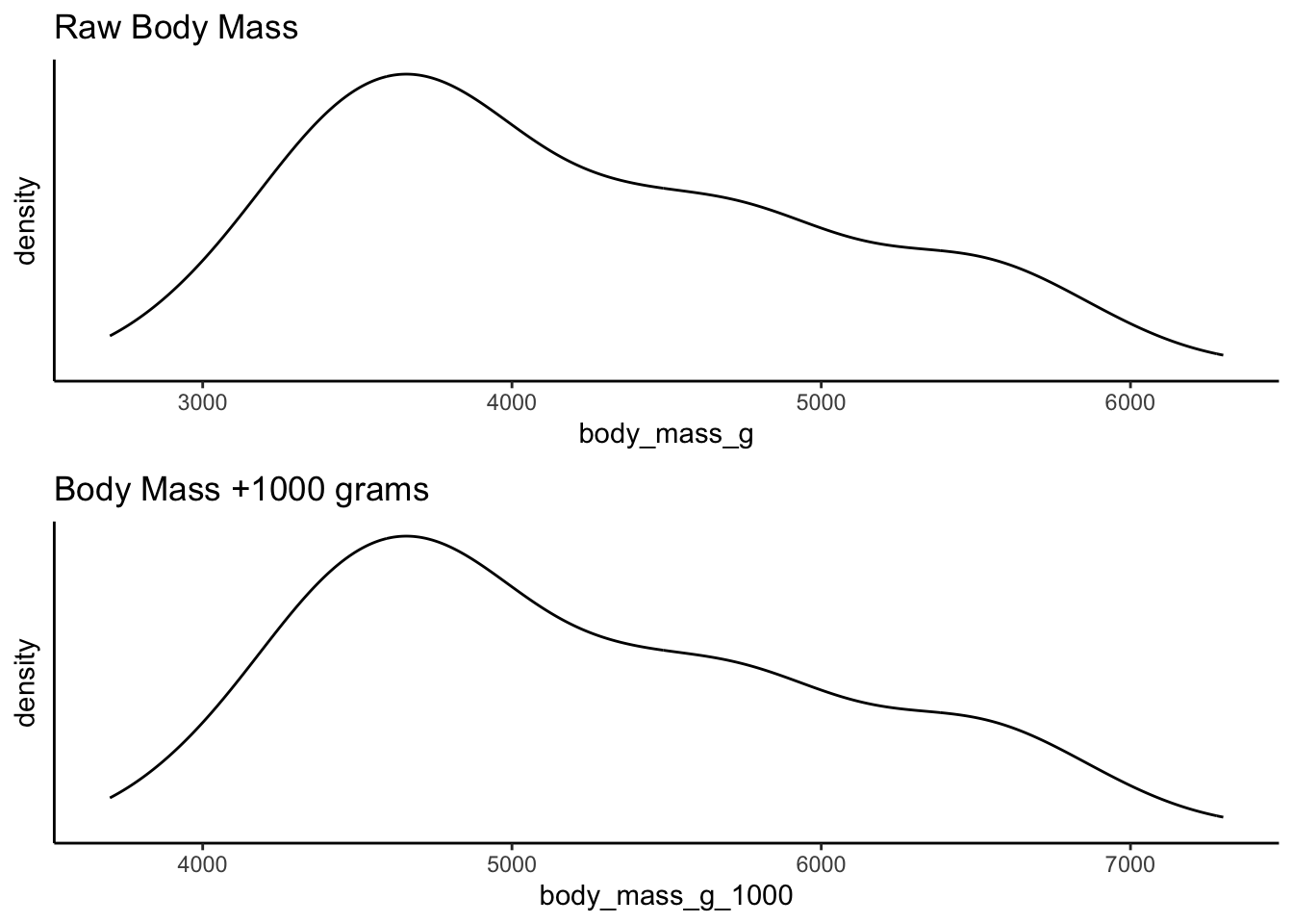
For example, compare the raw weight of penguins from the
palmerpenguins library against a linear transformation
which adds 1000 grams to each penguin. The shape of the distribution is
identical although the scale along the x-axis is different. This is
because the same thing has been done to each value in the
distribution:
Centering your data is a specific type of linear transformation. This
transformation subtracts the sample mean from each value, the result of
which is that the value 0 becomes the mean.
\[ x_i{_\text{centered}} = x_i - \bar{x} \]
where:
- \(x_i{_\text{centered}}\) is the centered value,
- \(x_i\) is the original value,
- \(\bar{x}\) is the sample mean.
Centering data is thus relatively simple to do in tidyverse:
Create a new dataframe called penguins2 which is a piped
copy of penguins. Then pipe into a drop_na()
to drop the NA values, and then create a mutate() call
which creates a new variable named body_mass_g_c. This
variable will be the result of subtracting the mean of body mass from
each value:
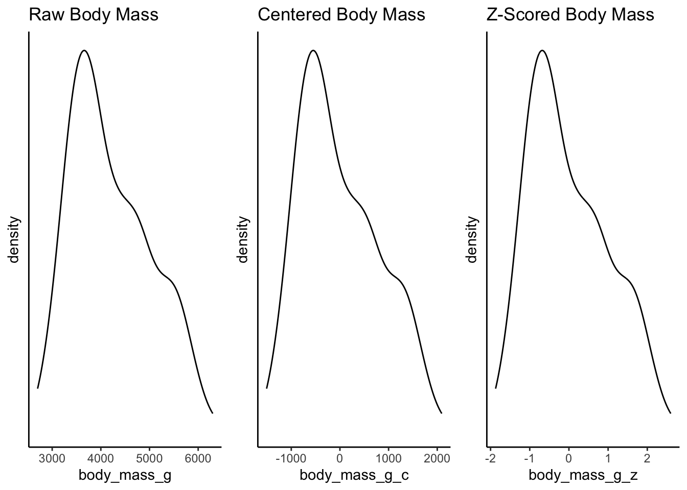
Take a look at the two distributions - again the shape is the same, but the x-axis has changed. The x-axis for the centered data now has zero as the mean, right in the middle of the distribution. This is called mean centering - the distribution is centered around the mean. The x-axis can now be interpreted as how far individual data points deviate from the mean.
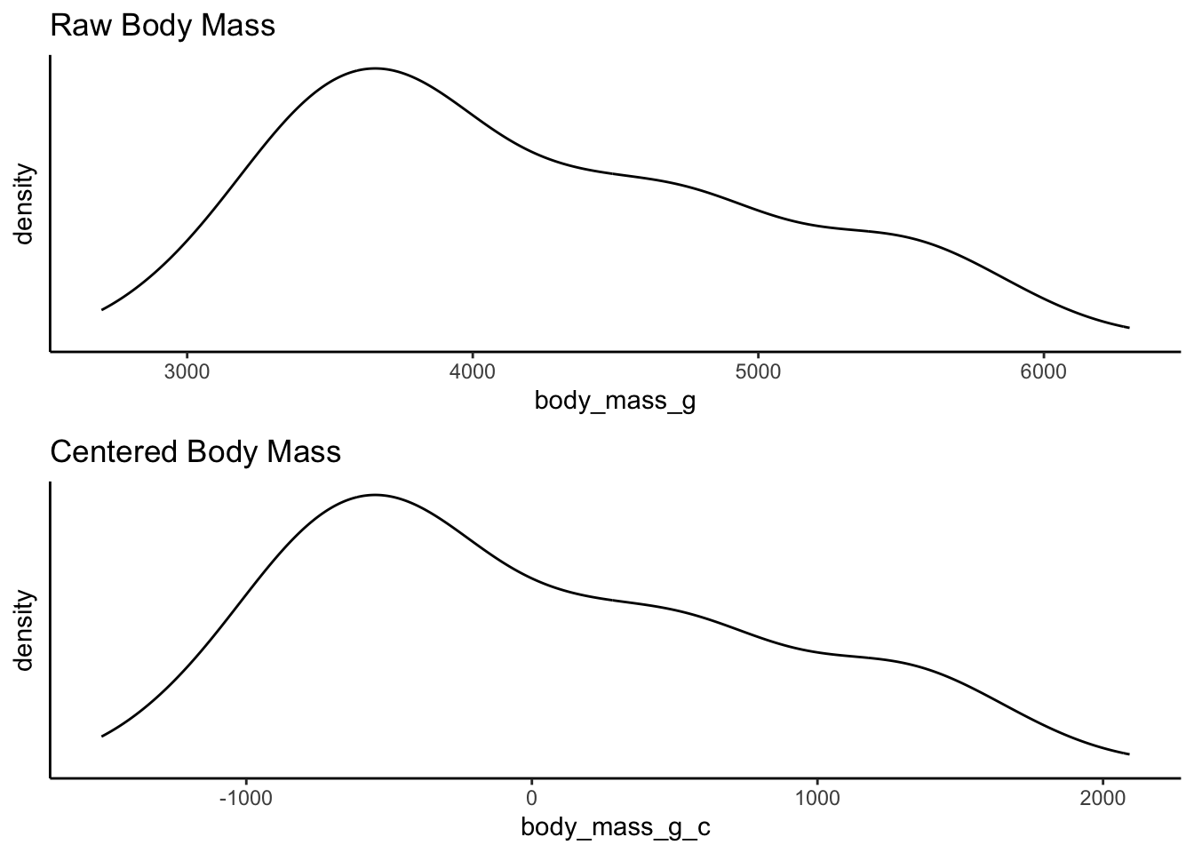
The reasons for this transformation become more apparent when we look into linear regression and the interpretation of coefficients. But for now, consider the practical utility of interpretation when the mean becomes 0. For example, we can now quite easily interpret the right skew of this data showing that the heaviest penguins are about 2000 grams heaver than the mean.
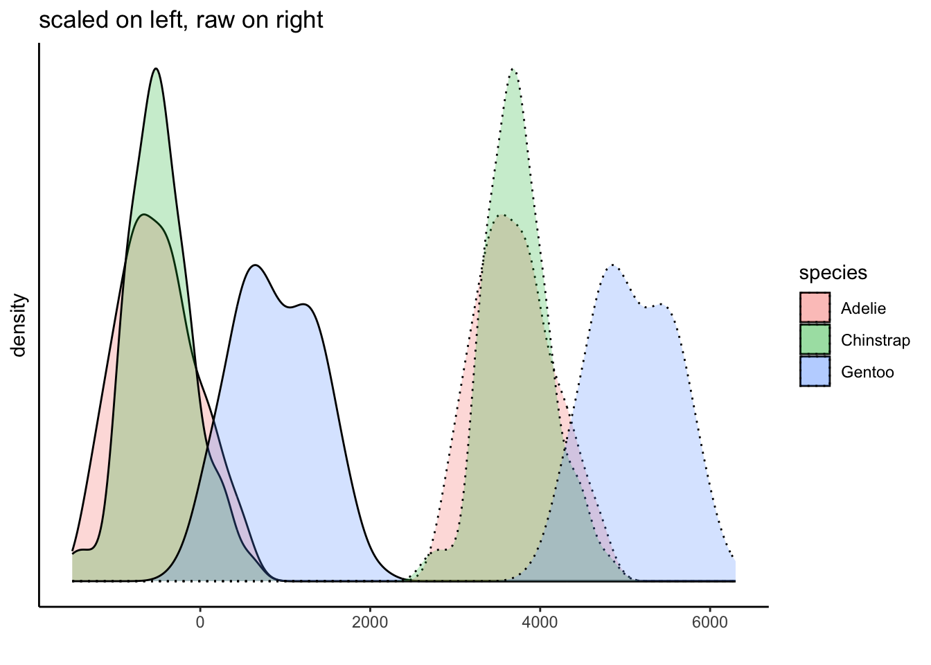
Of course, we do know that the groups have different distributions. But we have not mucked with that either because we have applied the same transformation to all of the data. This plot shows this, and further demonstrates how we can interpret the data within the context of the mean:
creating z-scores
In addition to centering, we can create z-scores from our variables by adding one more step to our calculations.
The z-score for a given value \(x_i\) can be calculated using the following formula:
\[ z_i = \frac{x_i - \mu}{\sigma} \]
where:
- \(z_i\) is the z-score of the
observation,
- \(x_i\) is the individual
observation,
- \(\mu\) is the population mean,
and
- \(\sigma\) is the population
standard deviation.
The difference is that the resulting centered values are now standardized by the population standard deviation. The resulting units now reflect changes in terms of standard deviations of the measure rather than in terms of the raw units.
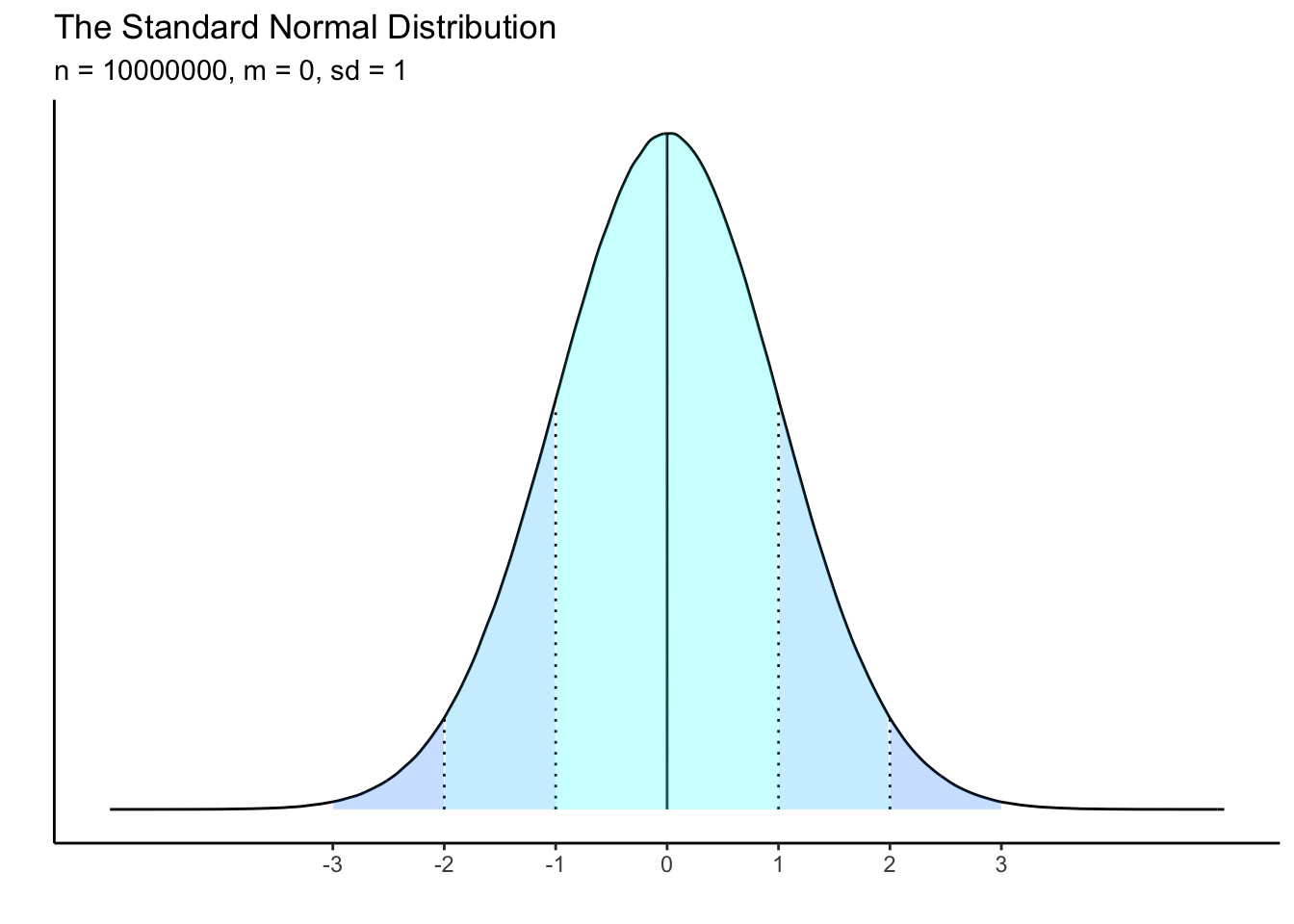
A distribution which is z-scored will have a mean of zero and a standard deviation of 1. This should remind you of the “normal” distribution, which has specific characteristics in terms of the spread of data from the mean.
Just like centering, when we z-score data, we are not changing the distribution of the data at all. Instead we are converting the interpretation of its scale. Compare the following plots and the difference in the x-axes:
What is the point of using z-scores? One reason is that it places different measurements onto an equal playing field. If you have two variables that are measured in very different units (e.g., kilometers versus miles), you cannot easily compare them in their raw units. But if you convert both units to z-scores, you can express their differences along the same standardized scale.
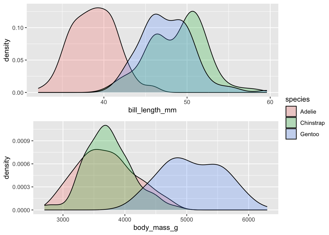
Let’s look at the raw units of bill_length_mm and
body_mass_g across the three different species of penguins.
What can you say in terms of how these variables differ between the
species? Or - think about it like this: is the difference between 40mm
and 50mm in bill length of greater/smaller magnitude than a difference
between 4000g and 5000g of body weight? The point is that we cannot
really compare the raw values this way.
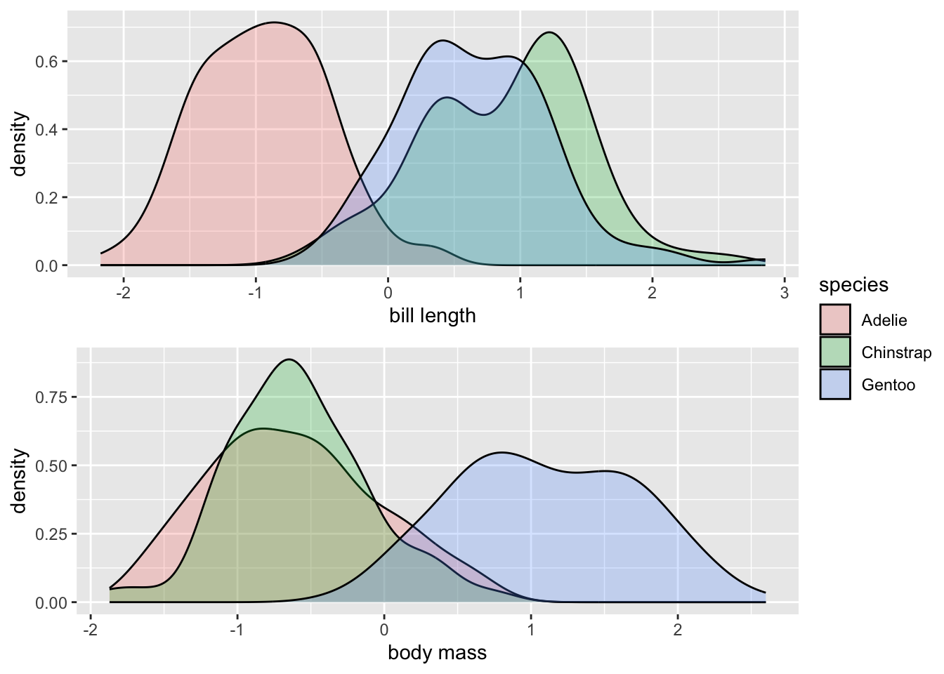
But if we z-score both variables, they are now on the same scale, and we can actually compare differences between the distributions more equally. You could practice by describing how the species of penguins differ from each other for both variables in terms of standard deviations. The utility of these comparisons will become more clear within the context of regression modelling.
how to calculate z-scores
Method 1: manual creation using the basic formula
The maths behind z-scores are not very complicated, and we can create
them quite quickly using a mutate() call in a pipe. Here is
how to create a z-score of body mass:
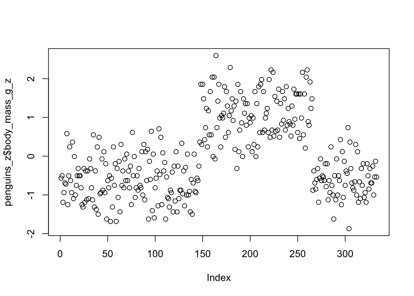
penguins_z <- drop_na(penguins) %>%
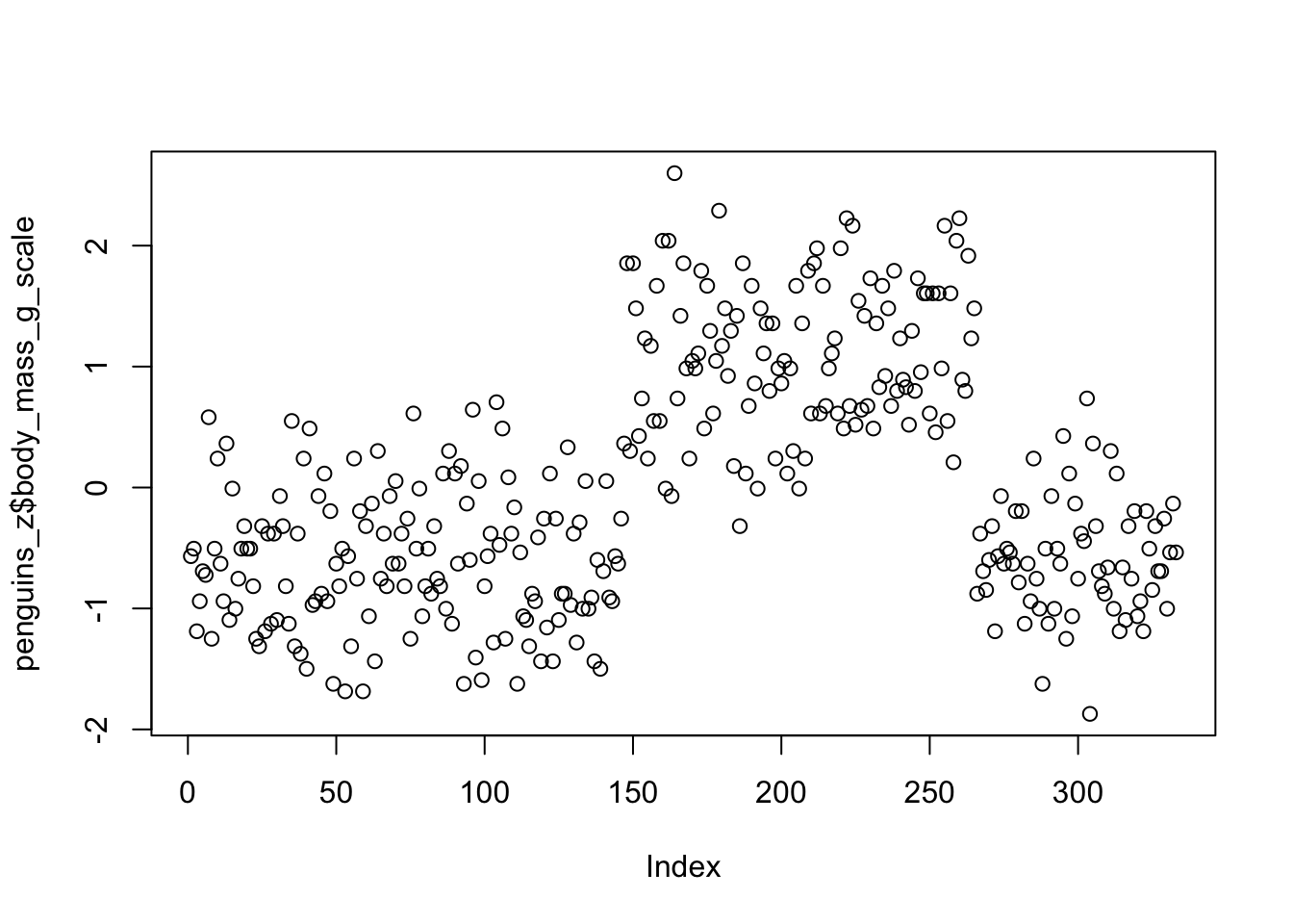
mutate(body_mass_g_z = (body_mass_g - mean(body_mass_g)) / sd(body_mass_g))We can do a quick scatter plot to see the y-axis ranges from -2 to 2. Remember, these are interpreted in units of standard deviation, where the mean = 0 and 1 = 1 standard deviation.
Method 2: using scale()
You can also use the r function scale() to both center
and standardize variables. You will get centered or scaled (z-scored)
variables depending on how you set the two arguments:
penguins_z <- drop_na(penguins) %>%
  mutate(body_mass_g_scale = scale(body_mass_g, center = TRUE, scale = TRUE))
The results are effectively identical.
However, using scale() can bring an annoyance with it.
The transformation using scale() attaches attributes to the
new vector:

Whereas our manual version does not:

The attributes can sometimes be annoying when combining dataframes
and working with column names. It is easy to remove them using the
as.vector() function: