── Attaching core tidyverse packages ──────────────────────── tidyverse 2.0.0 ──
✔ dplyr     1.1.4     ✔ readr     2.1.5
✔ forcats   1.0.0     ✔ stringr   1.5.1
✔ ggplot2   3.5.1     ✔ tibble    3.2.1
✔ lubridate 1.9.3     ✔ tidyr     1.3.1
✔ purrr     1.0.2
── Conflicts ────────────────────────────────────────── tidyverse_conflicts() ──
✖ dplyr::filter() masks stats::filter()
✖ dplyr::lag()    masks stats::lag()
ℹ Use the conflicted package (<http://conflicted.r-lib.org/>) to force all conflicts to become errors
Combining data from two different sources using joins
When working with long data, where participants have multiple observations in multiple rows, you will find that a lot of data is repeated. For instance, demographic features such as participant age and sex or experimental conditions will stay the same for each observation.
Sometimes you will want to add or manipulate data and join it with this repeated measures data.
For example, imagine you have a dataframe of scores for two subjects, five rows per subject:
# A tibble: 10 × 3
   subject score   age
   <chr>   <int> <dbl>
 1 one         1    42
 2 one         2    42
 3 one         3    42
 4 one         4    42
 5 one         5    42
 6 two        10    79
 7 two         9    79
 8 two         8    79
 9 two         7    79
10 two         6    79
We could manually sort and join the two objects, but we would prefer a method more precise. This is where joins come in.
1. Using left_join()
There are several ways to join, but the focus here will be on using left_join(). This function joins the rows of two tibbles into one object. The arguments for left_join() are:
x - the first tibble
y - the second tibble
by - a column or column(s) shared by both tibbles, used to match values
this last point is crucial - if the dataframes don’t have a shared columns, they can’t be joined.
left_join() means that the object on the left (x) is the final object to retain. All matches in y that are also in x will be added. For example:
Code
one <-tibble(subject =c(rep(1,5), rep(2,5)), score =1:10)one
# A tibble: 30 × 5
   subject test  score   age condition
     <int> <chr> <dbl> <dbl> <chr>
 1       1 pre    22.9  19.9 high
 2       1 post1  28.6  19.9 high
 3       1 post2  10.7  19.9 high
 4       2 pre    25.9  20.0 high
 5       2 post1  28.2  20.0 high
 6       2 post2  19.8  20.0 high
 7       3 pre    22.7  20.0 high
 8       3 post1  29.4  20.0 high
 9       3 post2  20.3  20.0 high
10       4 pre    20.1  20.2 high
# ℹ 20 more rows
6. Create a new tibble named output which contains the mean and sd of score at each test time, separated by condition
`summarise()` has grouped output by 'test'. You can override using the
`.groups` argument.
Code
output
# A tibble: 6 × 4
# Groups: test [3]
test condition mean.score sd.score
<chr> <chr> <dbl> <dbl>
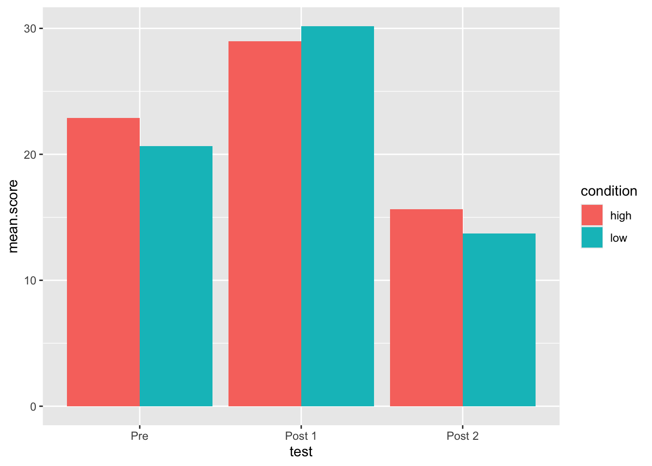
1 post1 high 29.0 0.971
2 post1 low 30.2 1.15
3 post2 high 15.6 4.51
4 post2 low 13.7 6.22
5 pre high 22.9 2.06
6 pre low 20.6 1.56
7. Now let us do some simple visualization using ggplot
ggplot is a function to plot data and is usually what you see when people show r plots. The function is more complicated than other functions, but we can learn the basics for now.
ggplot needs to know the data it is using, as well as what to define the x and y axis with. This is done with the following syntax:
ggplot(data, aes(x = column1, y = column2))
Can you make a ggplot from output in which mean.score is the y axis and test is the x axis?
You will want to see something like this:
Code
ggplot(output, aes(y = mean.score, x = test))
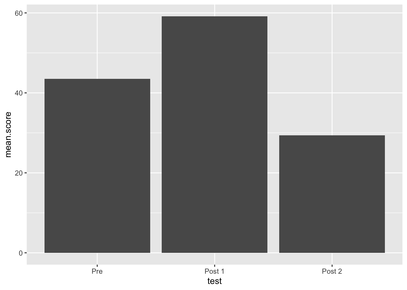
What’s wrong with our plot so far? The order of “test” is wonky. This is because R will auto-sort alphabetically. Let’s change this.
8. Reordering a factor
Create a new value named test2 which is the result of calling as.factor() on output$test. Then call a summary() on test2, then call the function levels() on test2 - what does this tell us?
Code
test2 <-as.factor(output$test)summary(test2)
post1 post2   pre
    2     2     2
Code
levels(test2)
[1] "post1" "post2" "pre"
We can use relevel() to set a new baseline level for our factor, but we might want more control than this.
Code
levels(relevel(test2, ref ='pre'))
[1] "pre" "post1" "post2"
The factor() function allows us to define the levels and the labels of our factor. The levels argument should match what it already in the data, and the labels can be used to give prettier text labels (e.g., for plotting
Code
factor(test2, levels =c('pre','post1', 'post2'))
[1] post1 post1 post2 post2 pre   pre
Levels: pre post1 post2
[1] Post 1 Post 1 Post 2 Post 2 Pre    Pre
Levels: Pre Post 1 Post 2
9. your turn: Please change the value of output$test to be a factor, with levels and labels matching test2. You can do this by assigning a value to itself: output$test = factor()
afterwards run summary() and levels() on output$test. you should see this:
10. Plot the same plot again, but this time save it as an object named my.plot. call the plot by typing the name - this time your x-axis should look better
Code
my.plot <-ggplot(output, aes(x = test, y = mean.score))my.plot
We want to add actual points to the plot, to do so we add geoms to the ggplot, which are different geometric objects. These geoms can also take their own aes arguments, making ggplot very powerful (but also confusing at times). Also, instead of a pipe %>%, you use a + to link geoms. add a geom_col() to the plot
Code
my.plot +geom_col()
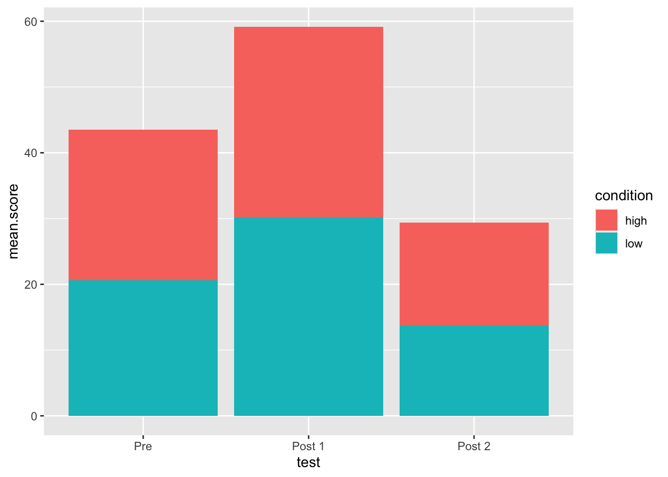
Now add an aes function inside geom_col and set fill to equal condition
Code
my.plot +geom_col(aes(fill = condition))
Now, let’s “dodge” the stacked columns so that they are side by side. Add the argument position inside geom_col but not inside aes and set it equal to 'dodge'
Code
my.plot +geom_col(aes(fill = condition), position ='dodge')