Scatterplots
2025-08-14
In this notebook we will look at how to plot points into scatterplots
using geom_point(). We will consider some of the different
ways plotting the individual data points can show trends or
relationships in the data. We will be using tidyverse and
the penguins data from palmerpenguins, so load
those resources.
We already know the basics of plotting with ggplot. Construct a
baseline plot that has body_mass_g on the x-axis and
flipper_length_mm on the y-axis.
adding a geom_point
Now, add a geom_point() to the ggplot. Inspect the plot
- what do you see?
Look at the bottom left corner of the plot, where the x/y axis meets.
Then, move right along the x-axis. What happens with values of
flipper_length_mm as values of body_mass_g
increase?
## Warning: Removed 2 rows containing missing values or values outside the scale range
## (`geom_point()`).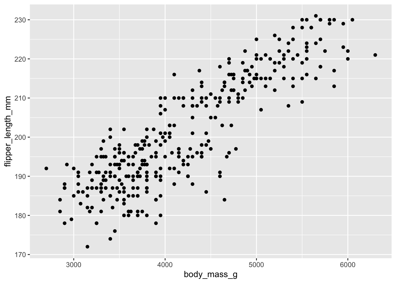
styling the geom point
We can add various options to the geom point, such as alpha, color, and size.
adding dodgerblue
## Warning: Removed 2 rows containing missing values or values outside the scale range
## (`geom_point()`).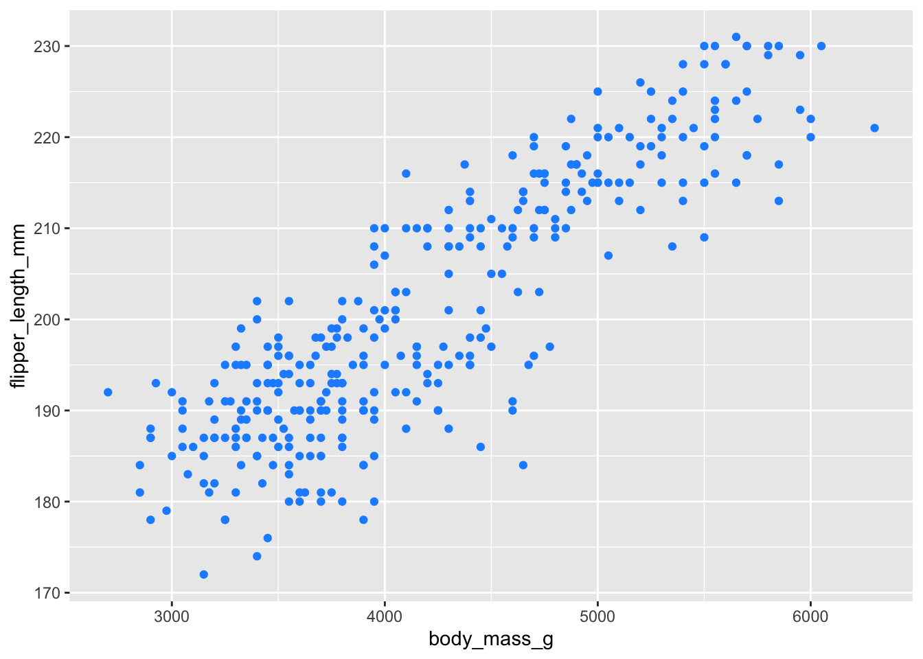
adding dogerblue + alpha of 50%
ggplot(penguins, aes(x = body_mass_g, y = flipper_length_mm)) +
  geom_point(color = 'dodgerblue', alpha = .5)
## Warning: Removed 2 rows containing missing values or values outside the scale range
## (`geom_point()`).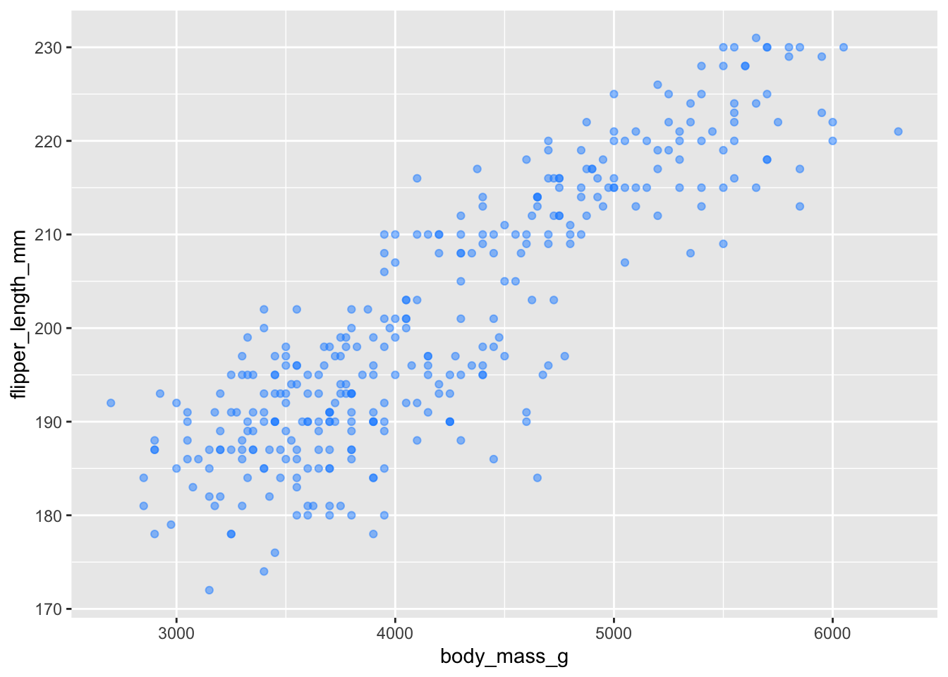
Adding dodgerblue + 50% alpha plus making the points larger.
ggplot(penguins, aes(x = body_mass_g, y = flipper_length_mm)) +
geom_point(color = 'dodgerblue', alpha = .5, size = 5) ## Warning: Removed 2 rows containing missing values or values outside the scale range
## (`geom_point()`).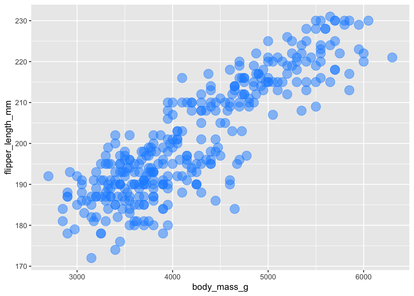
color by group
rather than changing the color of all the points, it is more useful
to change the colour based on a grouping variable. Species is a good
choice - add color = species to the global aes call (and
remove colour from the geom_point())
What do you see now? What additional inferences we can make?
ggplot(penguins, aes(x = body_mass_g, y = flipper_length_mm, color = species)) +
geom_point(alpha = .5) ## Warning: Removed 2 rows containing missing values or values outside the scale range
## (`geom_point()`).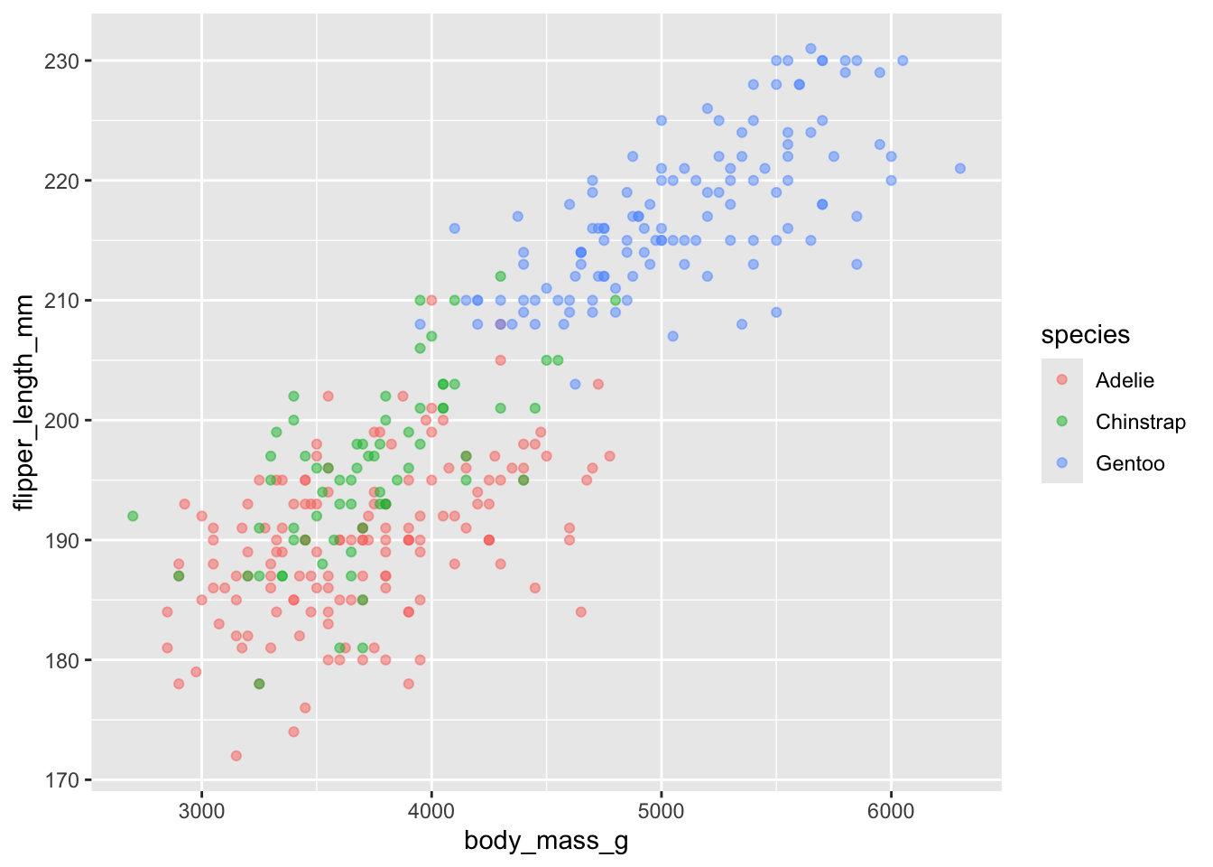
using size to bring in additional information
While we can specify a different size for all the points, we can also adjust the size of the points based on a continuous variable. Try this with an existing variable: body mass. We see that the size of the points gets larger, and a new piece of information has been added to the legend.
ggplot(penguins, aes(x = body_mass_g, y = flipper_length_mm, color = species, size = body_mass_g)) +
geom_point(alpha = .5) ## Warning: Removed 2 rows containing missing values or values outside the scale range
## (`geom_point()`).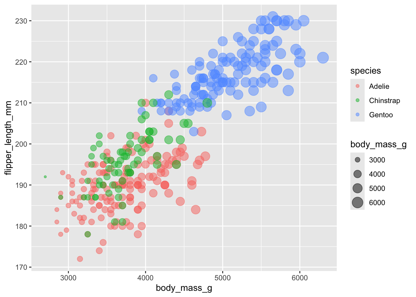
This is a bit redundant though - we can already visualise the size
using the x-axis. Try using another variable that is not in the
aes call to control the size of the points. Try adding
bill_depth_mm as the size variable.
What do you see? Which penguins have the deepest bills? Does this surprise you?
ggplot(penguins, aes(x = body_mass_g, y = flipper_length_mm, color = species, size = bill_depth_mm)) +
geom_point(alpha = .5) ## Warning: Removed 2 rows containing missing values or values outside the scale range
## (`geom_point()`).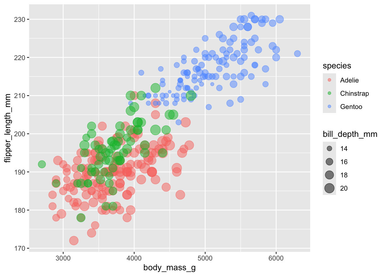
using shape
We can control the shape of the points using the shape
argument. The shapes are all assigned a different number code, which you
can see here
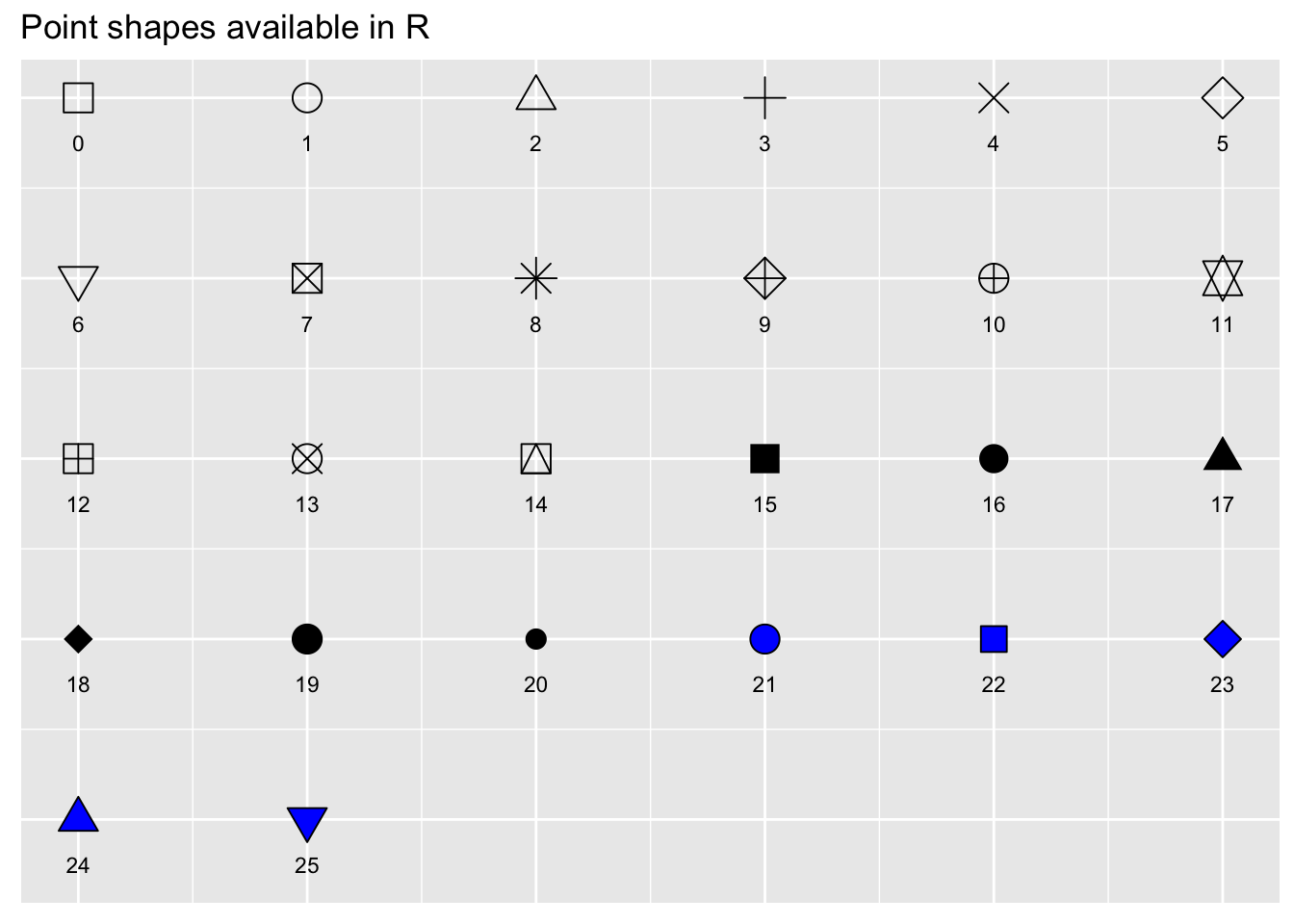
If we pass a variable to shape, then the different levels of that
variable will receive a different shape. Let’s add sex to
the shape argument. I also added drop_na() to
the penguins data to remove the two sexless penguins.
We can see some clustering based on sex as well, although this plot is starting to get a bit messy!
ggplot(drop_na(penguins), aes(x = body_mass_g, y = flipper_length_mm, color = species, size = bill_depth_mm, shape = sex)) +
geom_point(alpha = .5)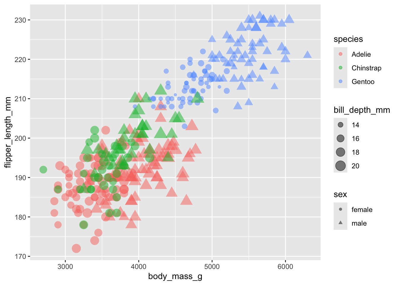
change the axes
Play around a bit and see what happens if you replace
flipper_length_mm with bill_depth_mm and
bill_length_mm. Do you see any other relationships?
We see here that bill depth is deeper for Adelia and Chinstrap penguins when compared to Gentoo. We also see a positive relationship between body size and bill depth which seems to be stable among species.
## Warning: Removed 2 rows containing missing values or values outside the scale range
## (`geom_point()`).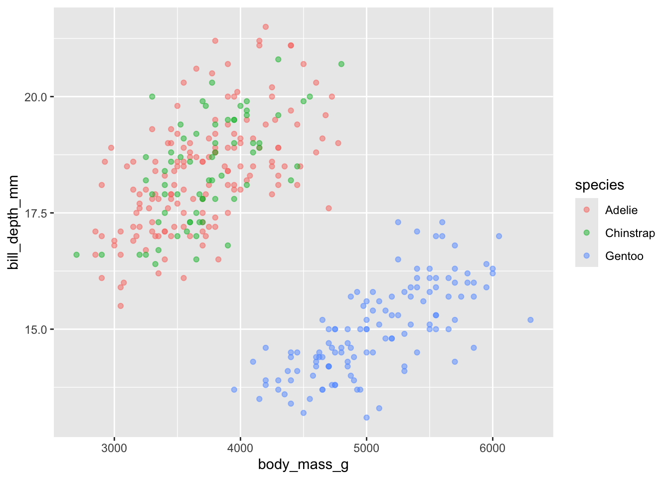
With bill length, it seems the chinstrap penguins have a longer bill on average, with a less clear positive relationship between size and bill length. There is a more straightforward relationship for the Gentoo and Adelie penguins.
ggplot(penguins, aes(x = body_mass_g, y = bill_length_mm, color = species)) +
  geom_point(alpha = .5)
## Warning: Removed 2 rows containing missing values or values outside the scale range
## (`geom_point()`).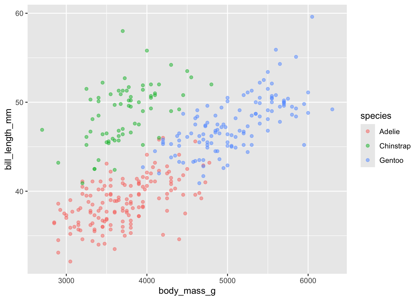
dealing with overlapping points using
geom_jitter()
Sometimes you have plots with many points which causes overlap among the different points.
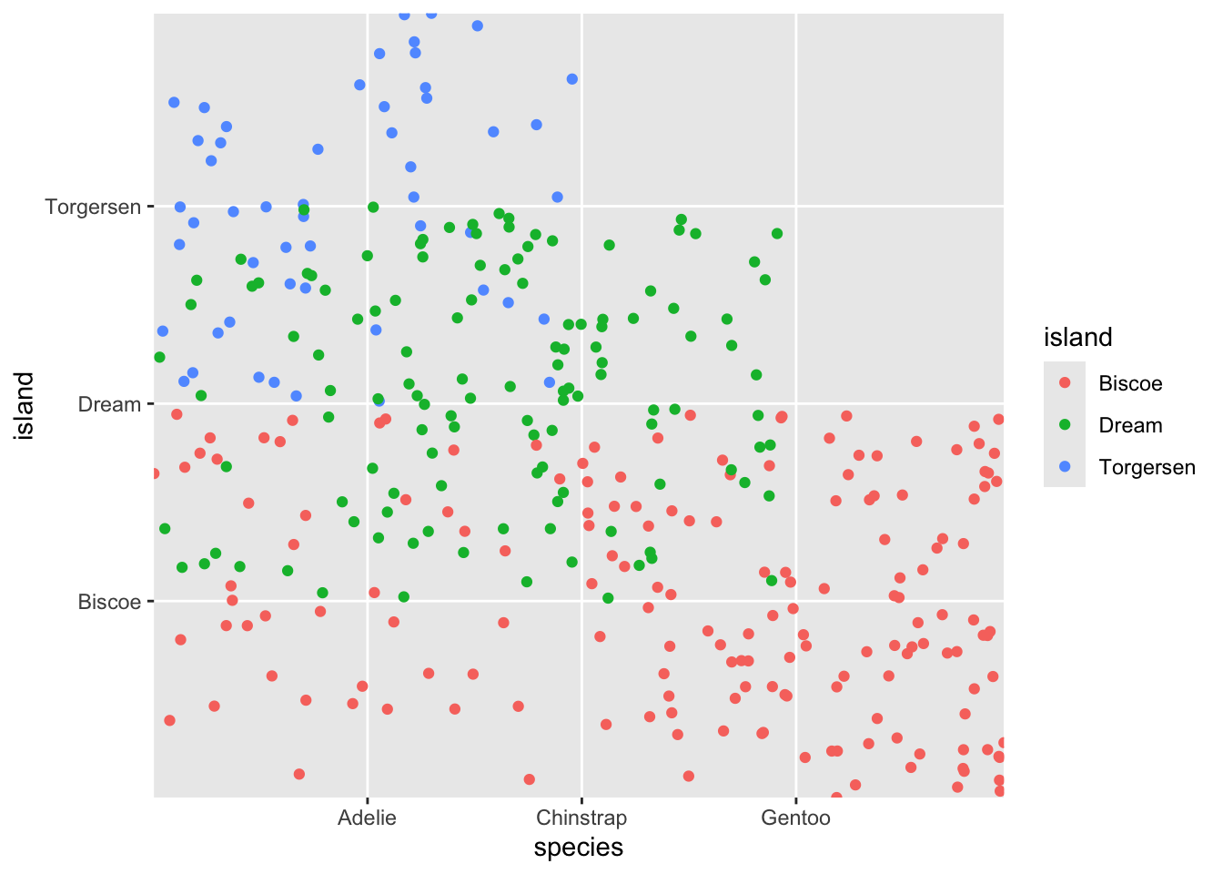
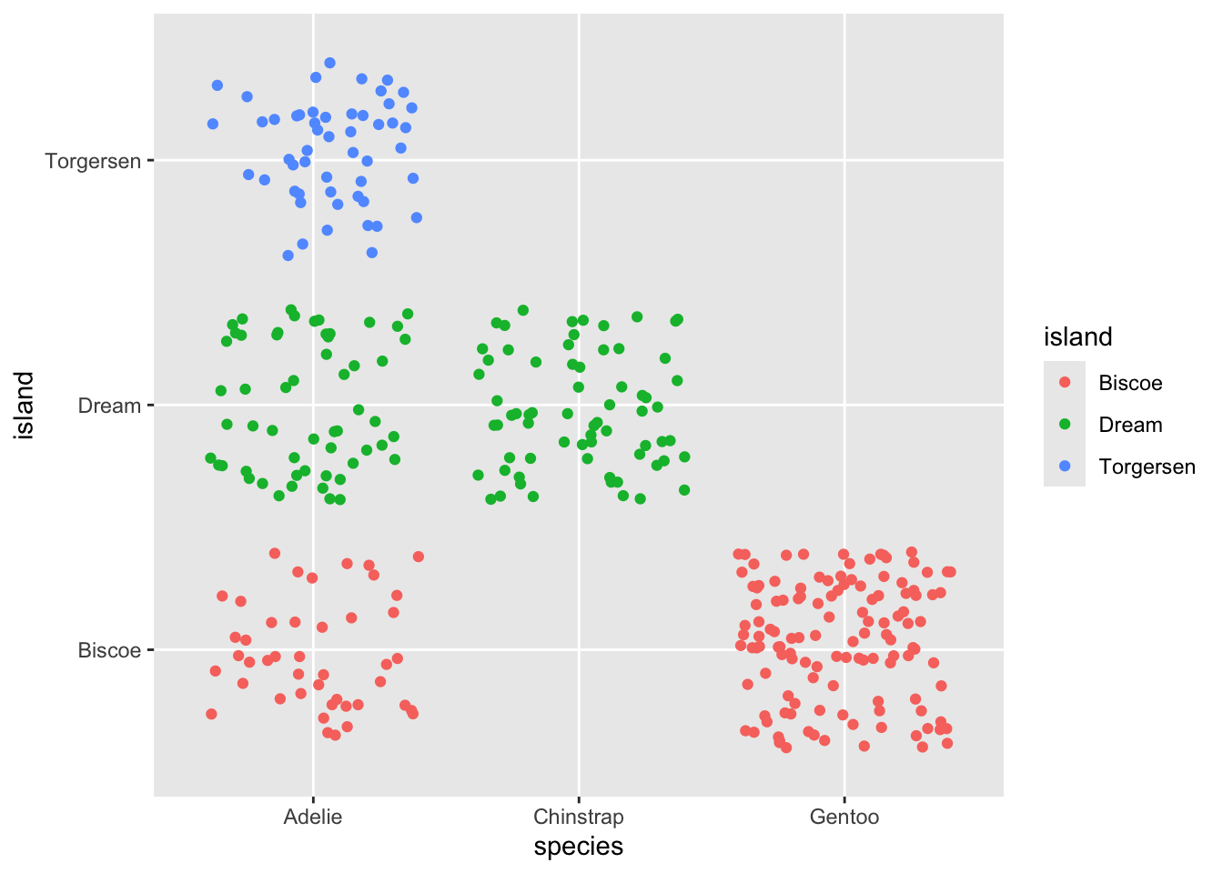
If we do something silly like plot island on the y axis and species on the x axis, we get the following plot:
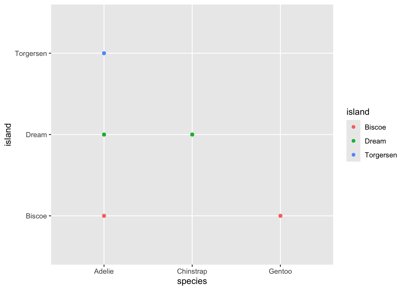
While it may look lie there are five different points, in
fact there is still one point per observation. So these points are all
standing on top of one another. We can use a similar geom,
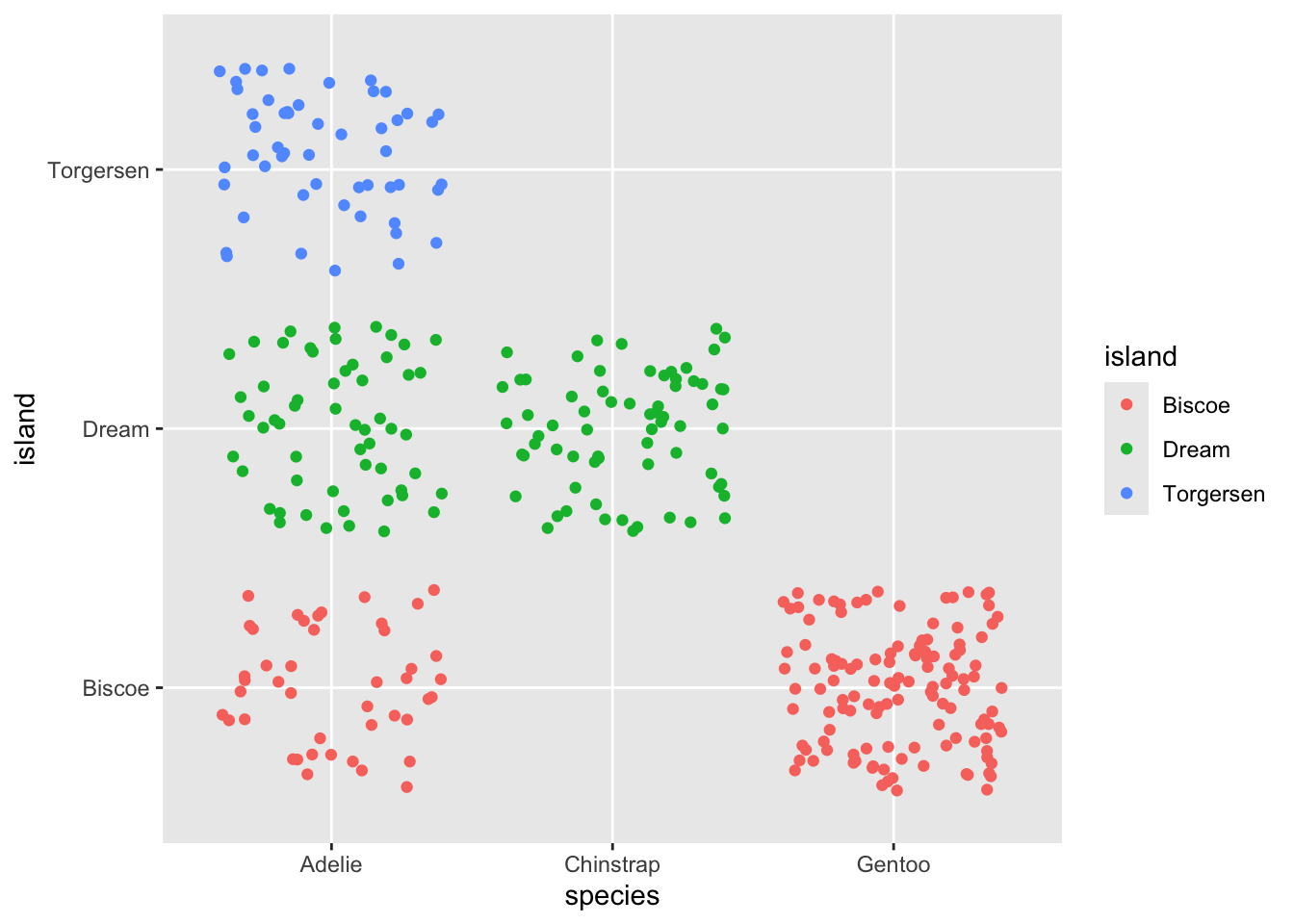
geom_jitter() to demonstrate this.
The geom jitter “jitters” the points by moving them around a bit. By default this is random, so you will get slightly different looking plots each time.
Jitter once..
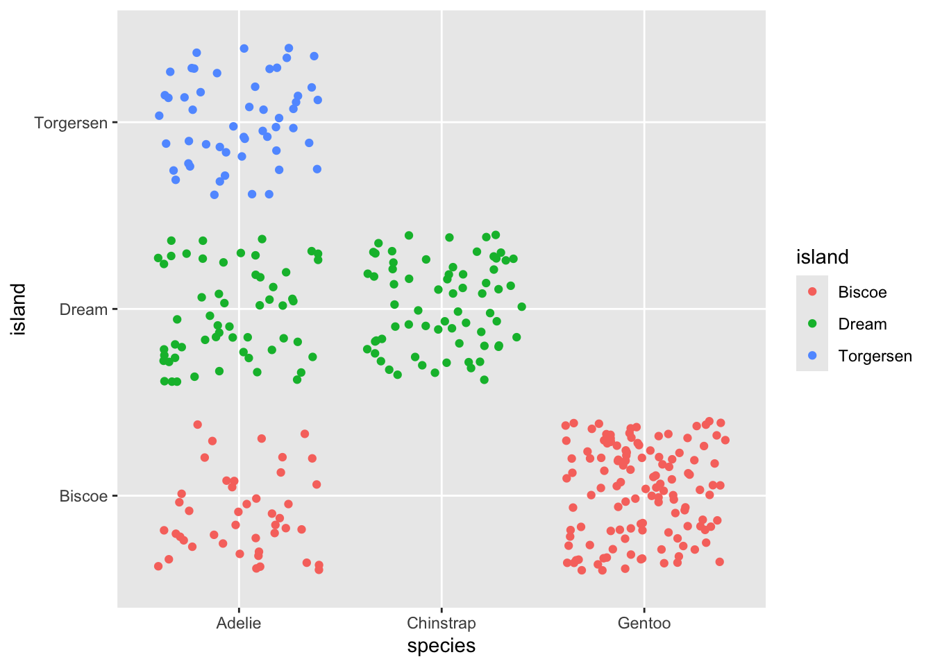
Same plot with new jitter movement…
And a third time!..
controlling the jitter
You can use width and height to control the
extent of the jitter spacing
Tight jitter…
ggplot(penguins, aes(y = island, x = species, color = island)) +
  geom_jitter(width = .1, height = .1)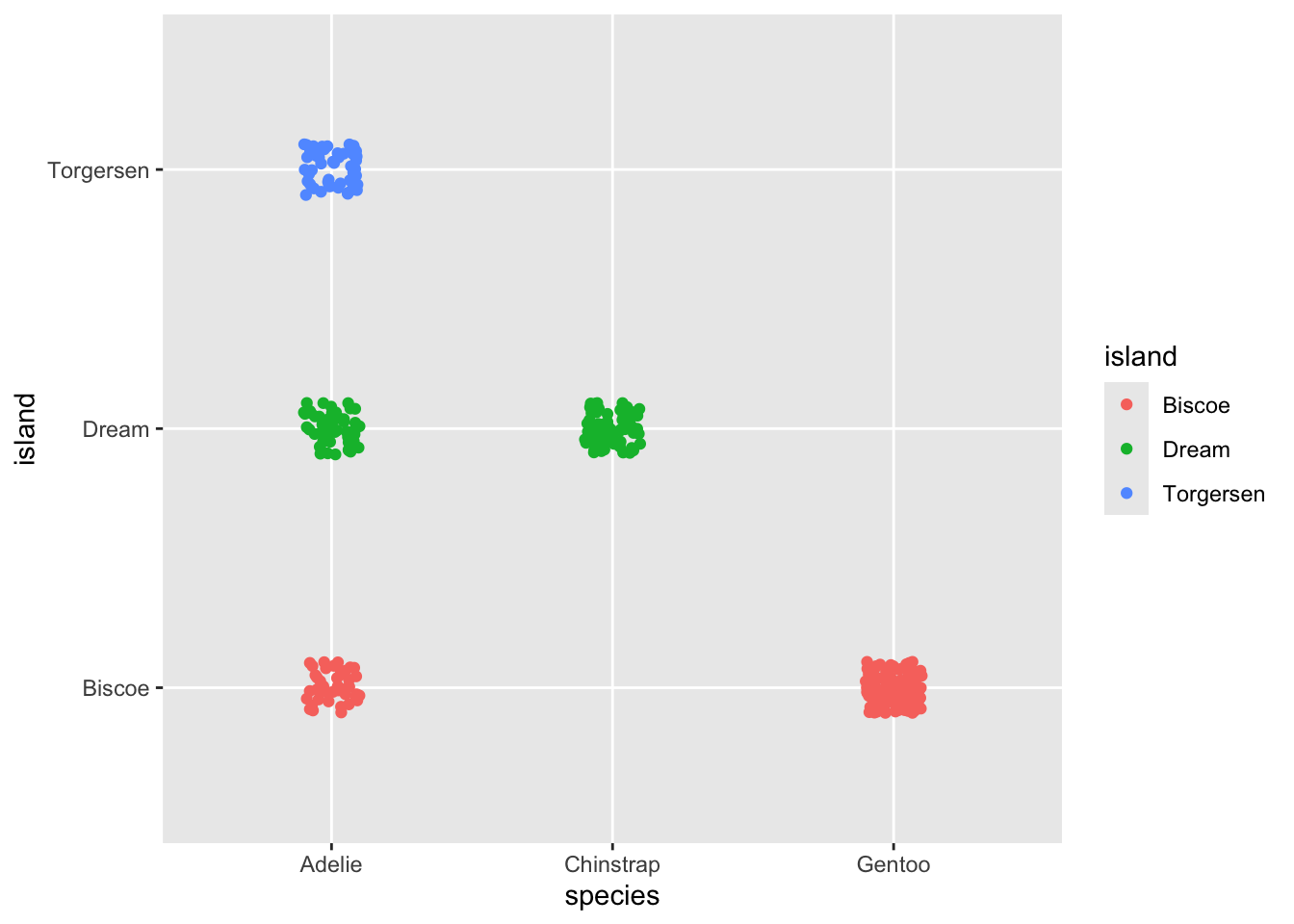
Relatively good jitter
ggplot(penguins, aes(y = island, x = species, color = island)) +
  geom_jitter(width = .25, height = .25)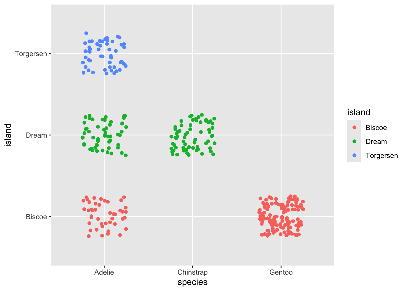
utter madness!