barplots
2025-04-10
Bar charts and bar plots are sometimes useful. Knowing how they work
in R requires a bit of under-the-hood understanding of the
stat() argument inherent to the relevant geoms. Load in the
penguin data.
## ── Attaching core tidyverse packages ──────────────── tidyverse 2.0.0 ──
## ✔ dplyr     1.1.4     ✔ readr     2.1.5
## ✔ forcats   1.0.0     ✔ stringr   1.5.1
## ✔ ggplot2   3.5.1     ✔ tibble    3.2.1
## ✔ lubridate 1.9.3     ✔ tidyr     1.3.1
## ✔ purrr     1.0.2
## ── Conflicts ────────────────────────────────── tidyverse_conflicts() ──
## ✖ dplyr::filter() masks stats::filter()
## ✖ dplyr::lag()    masks stats::lag()
## ℹ Use the conflicted package (<http://conflicted.r-lib.org/>) to force all conflicts to become errorsThere are two common ways to use bar charts. One typical use is to
use bar-charts to plot single points, such as means, and compare the
height of the bars, which is the default behaviour of
geom_col(). Another useful way to use bar charts is to
present count data (i.e., tallies of things), which is the default
behavior of geom_bar().
First we look at the single-point method:
Method 1: Plotting an individual point
Let’s create a bar chart that compares the mean weight of penguins in
the 3 different species and by sex. Create a df named
penguin_weight which is the result of a piped summary.
Group by sex and species. Create two new variables:
avg_weight and sd_weight from the
body_mass_g column. If you need a refresher on how to
create summary statistics from dataframes, go here.
Add a drop_na() to ditch the sexless penguins.
penguin_weight <- penguins %>%
  group_by(sex, species) %>%
  summarise(avg_weight = mean(body_mass_g, na.rm = T),
            sd_weight = sd(body_mass_g, na.rm = T)) %>%
  drop_na()
## `summarise()` has grouped output by 'sex'. You can override using the
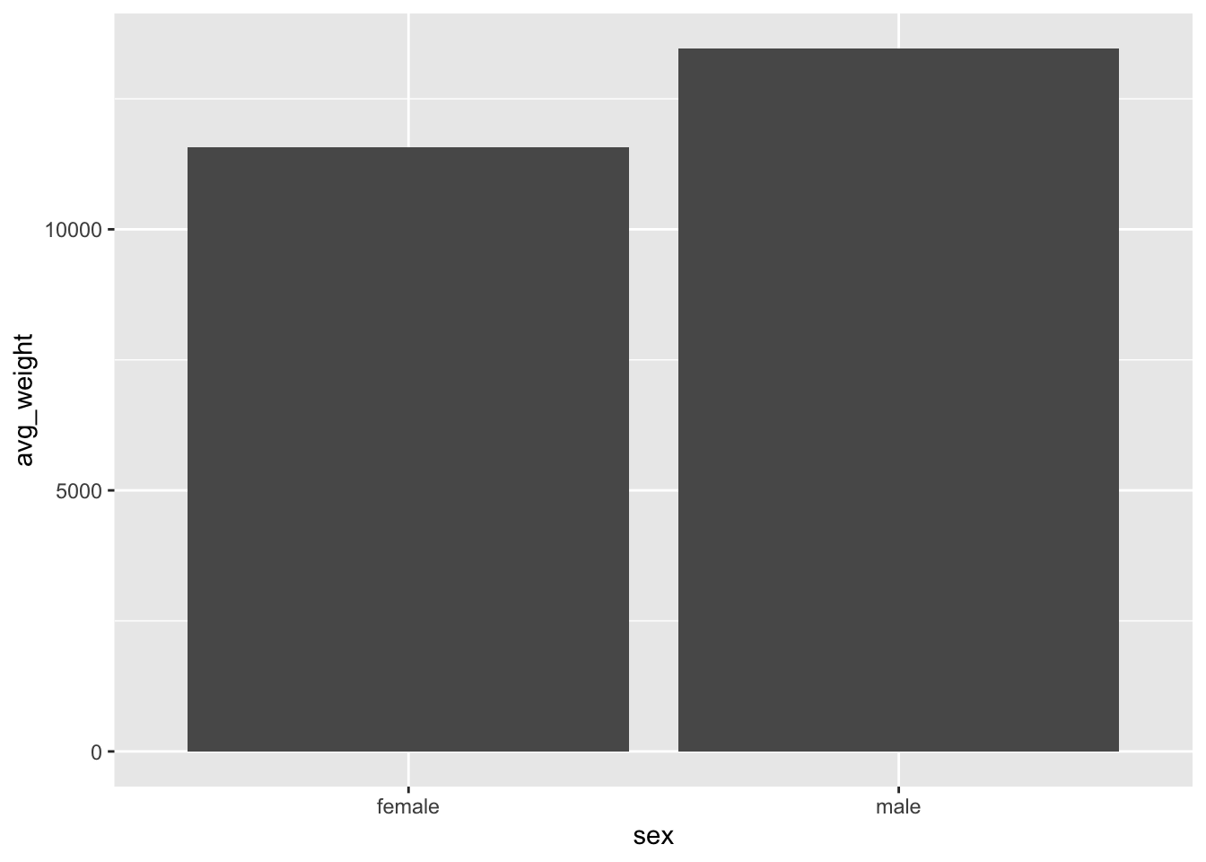
## `.groups` argument.To plot the individual points, we will use the
geom_col() object.
Set the y axis to the average weight, and the x axis to sex.
What is the problem here? We only have two columns, but we know there
are 3 species x 2 sexes, so we expect three columns! The issue is that
the default behavior for geom_col() is to position the bars
in a stacked orientation.
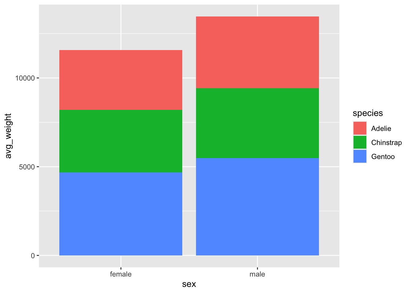
stacked vs. dodged
Add a fill argument for species and we can see that there are indeed
different values for each species. However, they are stacked on top of
one another, making it difficult to precisely compare the weights of
different species. This is because the default position for
geom_col() is stacked.
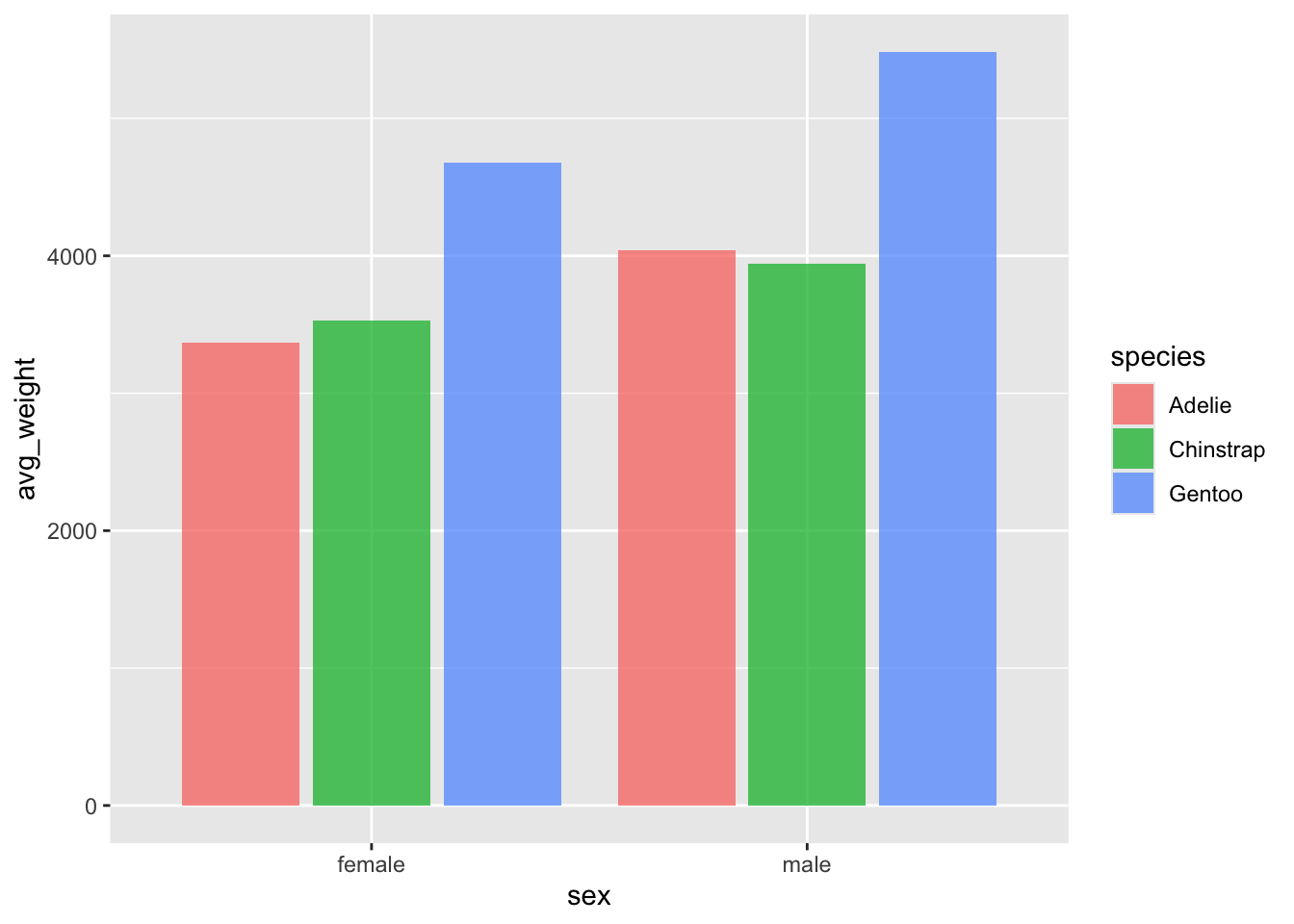
Change the position argument to 'dodge' in
geom_col(). We now get a much better picture of the mean
weight, and can more easily compare the species by weight and by
sex.

adding an error bar
Let’s add error bars to our plot, which we will define as +/- one standard deviation from the mean.
Add a geom_errorbar(), which requires values for the
arguments ymin and ymax. Set ymin
to be equal to avg_weight - sd_weight, and
ymax to be equal to avg_weight + sd_weight
What happened? Our error bars are all stacked in the centre, without following our bars. Ah ha - we need to tell the errorbars to also be dodged!
ggplot(penguin_weight, aes(y = avg_weight, x = sex, fill = species)) +
geom_col(position = 'dodge') +
geom_errorbar(aes(ymin = avg_weight - sd_weight,
ymax = avg_weight + sd_weight))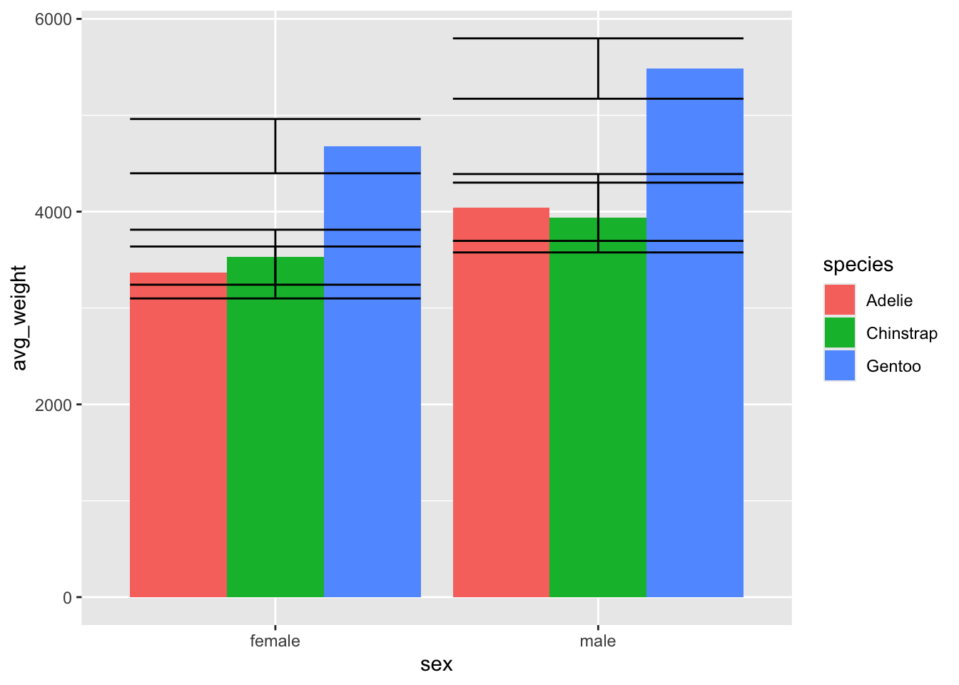
Nice, now we have some measure of variation on the bars as well!
ggplot(penguin_weight, aes(y = avg_weight, x = sex, fill = species)) +
  geom_col(position = 'dodge') +
  geom_errorbar(aes(ymin = avg_weight - sd_weight,
                    ymax =  avg_weight + sd_weight), position = 'dodge')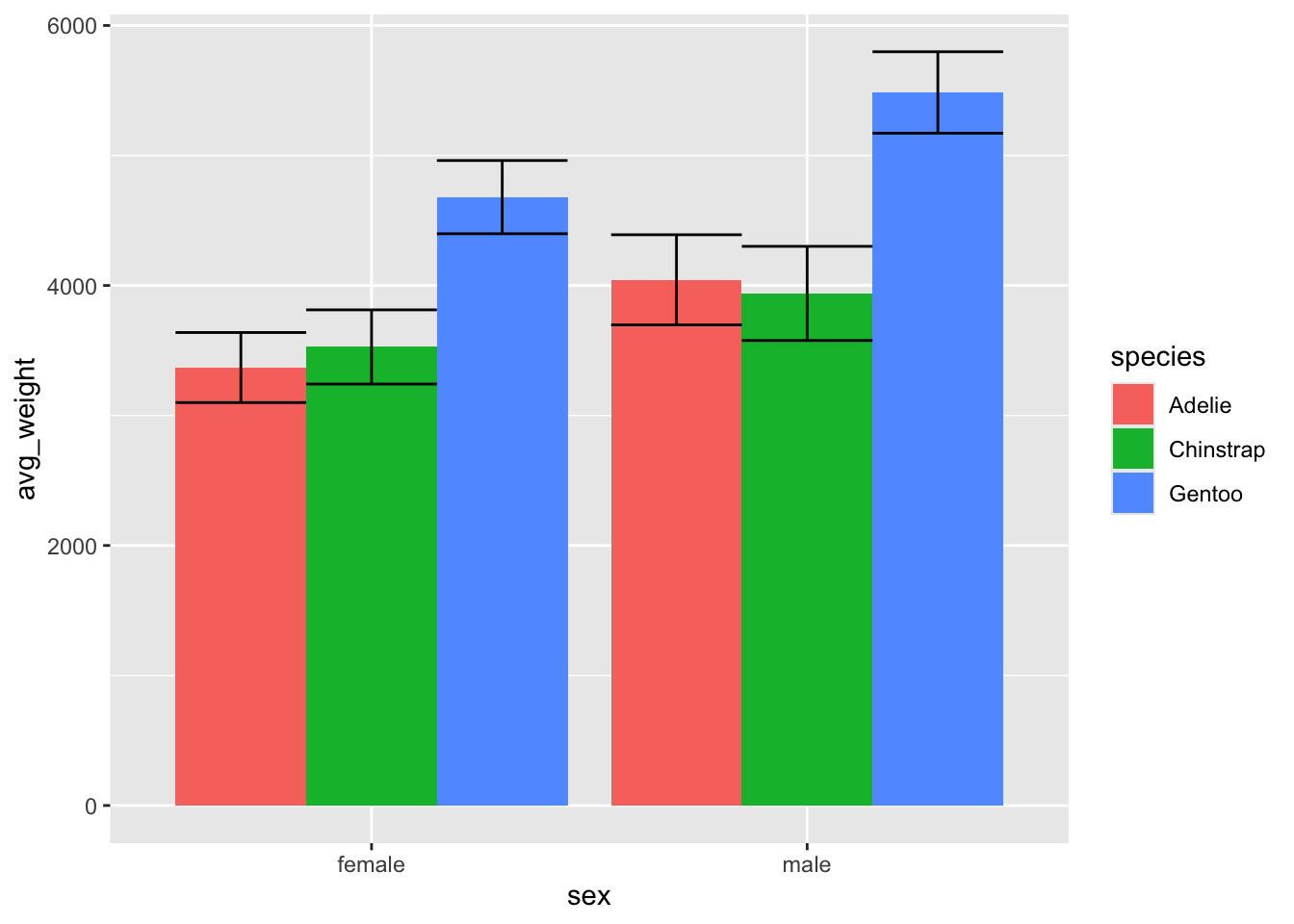
interlude - bars vs. points, ‘dodge’ vs. position_dodge()
What happens if we use geom_point() instead of
geom_col()? We lost the dodged behaviour and attract a
message telling us that ‘dodge’ isn’t a valid argument for
position and that we need to specify a width using
position_dodge() instead.
ggplot(penguin_weight, aes(y = avg_weight, x = sex, fill = species)) +
  geom_point(position = 'dodge') +
  geom_errorbar(aes(ymin = avg_weight - sd_weight,
                    ymax =  avg_weight + sd_weight), position = 'dodge')
## Warning: Width not defined
## ℹ Set with `position_dodge(width = ...)`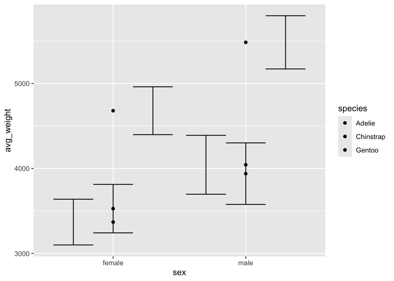
Try adding position_dodge() and put .9 as
the width argument for both the points and the errorbars. The dots now
line up nicely with the error bars, although we want to probably add
some color or other styling to distinguish the species.
ggplot(penguin_weight, aes(y = avg_weight, x = sex, fill = species)) +
  geom_point(position = position_dodge(width = .9)) +
  geom_errorbar(aes(ymin = avg_weight - sd_weight,
                    ymax =  avg_weight + sd_weight), position = position_dodge(.9))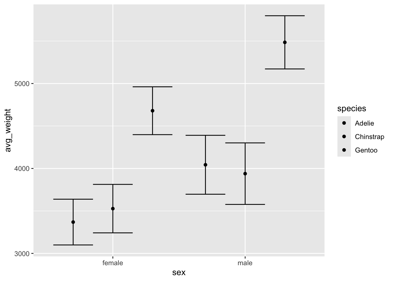
Here I add 3 things:
- I set shape and color = to species, which adds a legend and distinguishes the points by species.
- I add
width = .25to thegeom_errobar(), which has shrunk the size of the geom.
ggplot(penguin_weight, aes(y = avg_weight, x = sex, fill = species, shape = species, color = species)) +
  geom_point(position = position_dodge(width = .9)) +
  geom_errorbar(aes(ymin = avg_weight - sd_weight,
                    ymax =  avg_weight + sd_weight),
                position = position_dodge(.9), width = .25)
what the hell does width do?
On its own, the width argument will change the entire width of the
geom, which is why the overall size of the errorbars have changed. This
side is what position = 'dodge' will use. So if we set
width = .25 and position = 'dodge', the
errorbars will now be adjusted by their new size, which is 25% scale.
The result is they no longer line up with the geom_points, which have
been dodged by .9!
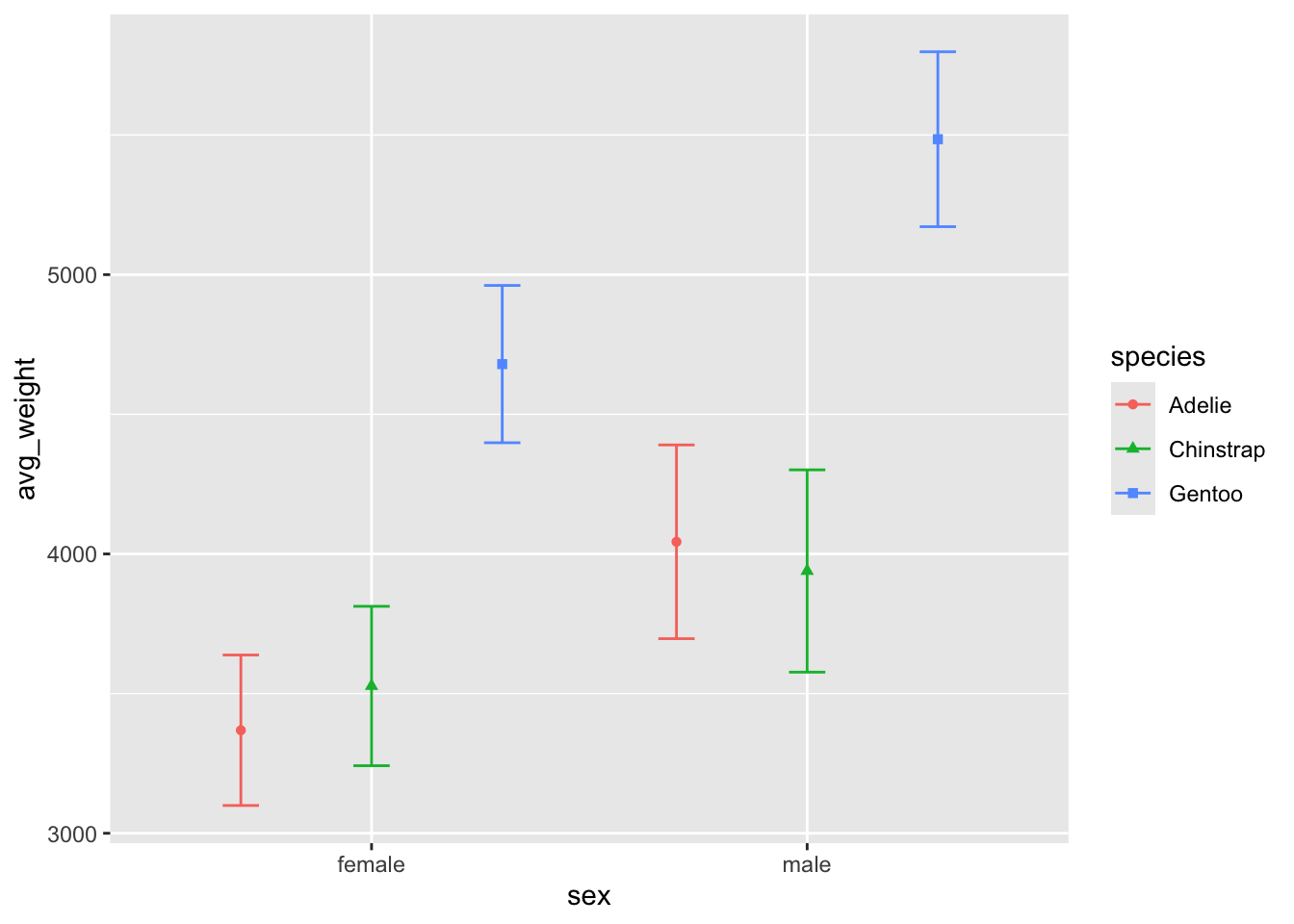
ggplot(penguin_weight, aes(y = avg_weight, x = sex, fill = species,
                           shape = species, color = species)) +
  geom_point(position = position_dodge(width = .9)) +
  geom_errorbar(aes(ymin = avg_weight - sd_weight,
                    ymax =  avg_weight + sd_weight),
                position = 'dodge', width = .25)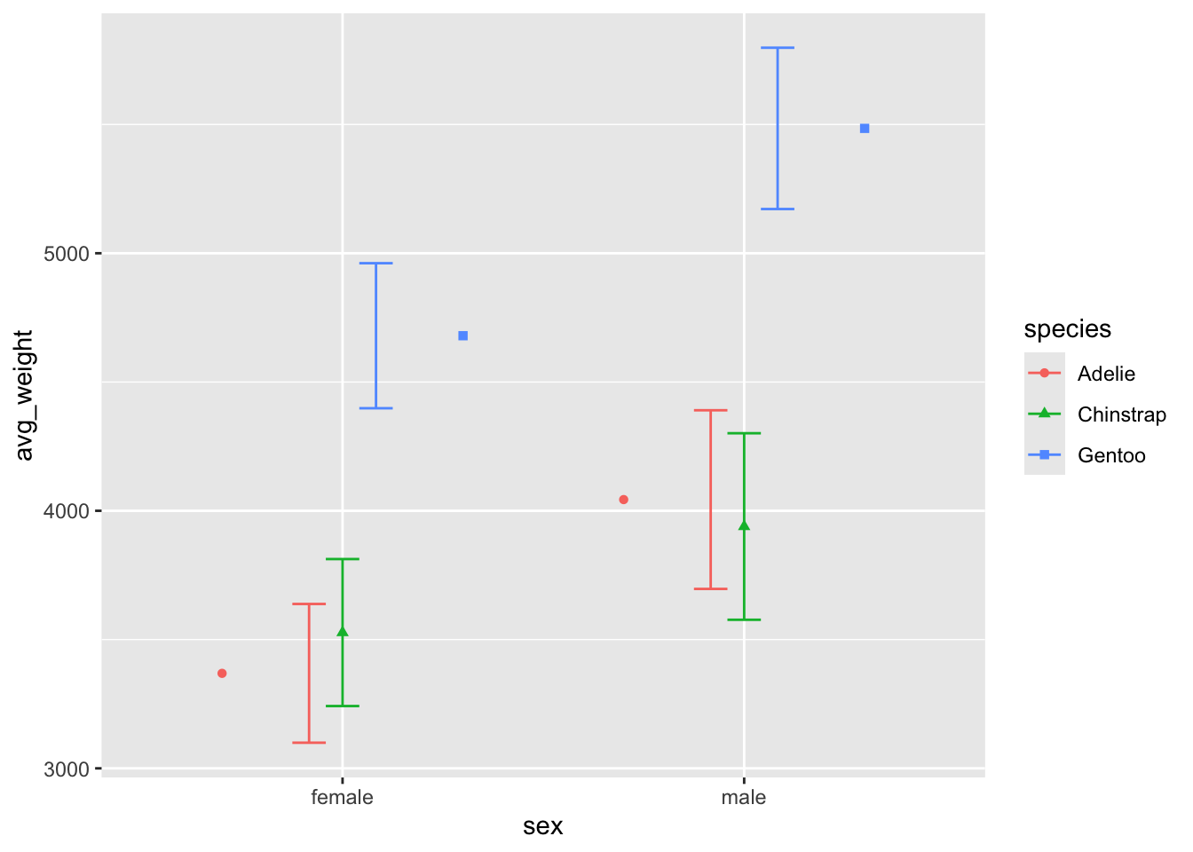
We can verify this is happening by changing the width
argument back to .9 for the errorbar: things line up now!
ggplot(penguin_weight, aes(y = avg_weight, x = sex, fill = species,
                           shape = species, color = species)) +
  geom_point(position = position_dodge(width = .9)) +
  geom_errorbar(aes(ymin = avg_weight - sd_weight,
                    ymax =  avg_weight + sd_weight),
                position = 'dodge', width = .9)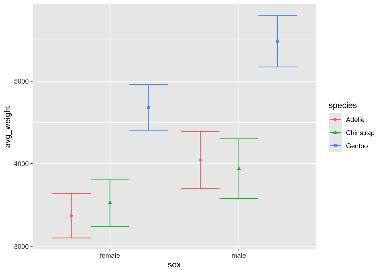
But if we want to line up the points and errors bars and
change the overall size of the errorbars to be smaller, we should use a
combination of position_dodge() and width:
Here we dodge both geoms by the same amount (.9), and also tell
geom_errorbar to be .25 its normal size.
ggplot(penguin_weight, aes(y = avg_weight, x = sex, fill = species,
                           shape = species, color = species)) +
  geom_point(position = position_dodge(width = .9)) +
  geom_errorbar(aes(ymin = avg_weight - sd_weight,
                    ymax =  avg_weight + sd_weight),
                position = position_dodge(.9), width = .25)
If we wanted to add more geoms, we should ensure they have the same
dodging amount. You can try using position_dodge2() when
necessary to create a bit of padding between larger geoms.
Now we are getting a pretty nice looking plot!
ggplot(penguin_weight, aes(y = avg_weight, x = sex, fill = species,
                           shape = species, color = species)) +
  geom_point(position = position_dodge(width = .9)) +
  geom_errorbar(aes(ymin = avg_weight - sd_weight,
                    ymax =  avg_weight + sd_weight),
                position = position_dodge(.9), width = .25) +
  geom_col(position = position_dodge2(.9), alpha = .5)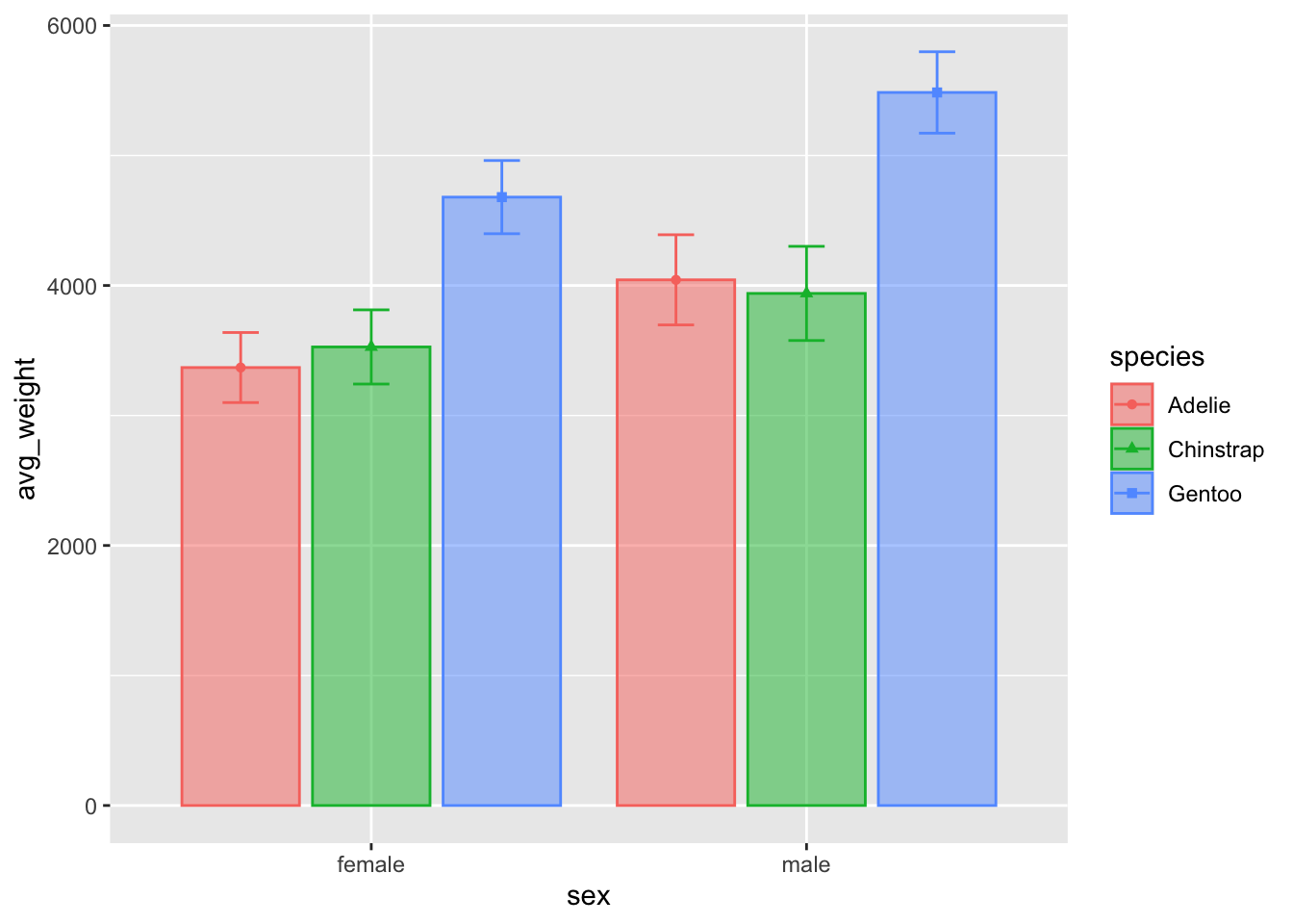
col vs. point???
What effect does representing a single point as a bar have on our interpretation / comparisons of the data?
Compare the two plots - what are the benefits / drawbacks of each plot in terms of describing the data? Which one do you think looks better ? :)

Perhaps the biggest difference is the scale of the yaxis, in that the
geom_point() plot does not include the total range of
weight. That could be easily changes with the ylim()
argument, which lets you specify the lower and upper bound of the
chart:
ggplot(penguin_weight, aes(y = avg_weight, x = sex, fill = species,
                           shape = species, color = species)) +
  geom_point(position = position_dodge(width = .9)) +
  geom_errorbar(aes(ymin = avg_weight - sd_weight,
                    ymax =  avg_weight + sd_weight),
                position = position_dodge(.9), width = .25) +
  ylim(0, 6000)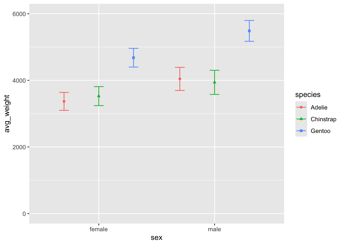
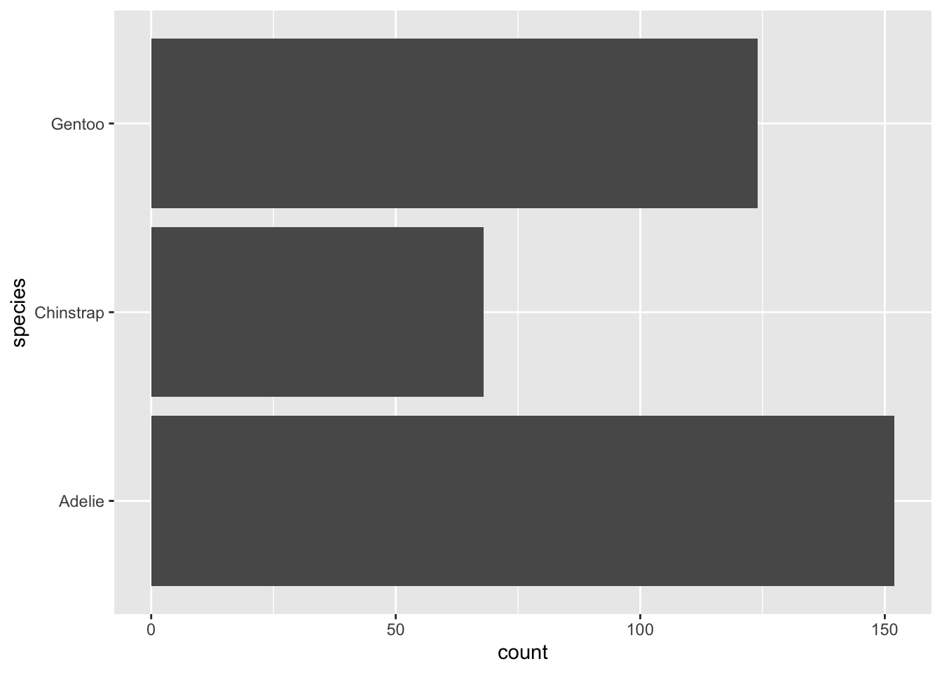
Method 2: Plotting the total counts of things
The geom_bar() is very similar to
geom_col(), except that by default will want to count the
number of observations of a variable. For example, if we want to count
the penguins in each species, we can easily ask for this with the
default geom_bar() and by passing the variable we want to
count as either the x or y axis.
 Adding both an x and a y axis will result in an error - this is true of
all
Adding both an x and a y axis will result in an error - this is true of
all geoms which use stat = count as the
default. This is because the plot uses whichever axis is free for the
created count variable.
## Error in `geom_bar()`:
## ! Problem while computing stat.
## ℹ Error occurred in the 1st layer.
## Caused by error in `setup_params()`:
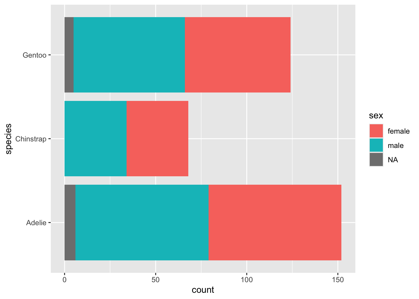
## ! `stat_count()` must only have an x or y aesthetic.We can instead use fill or other grouping aesthetics to
show this information visually. Here I add sex as fill, which gives us
another stacked plot:
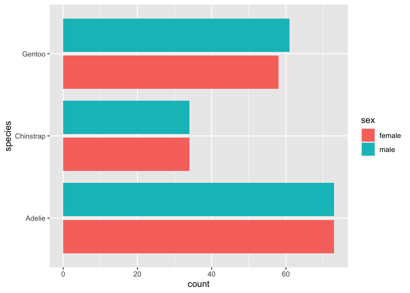
Go ahead and wrap drop_na() around
penguins, and also ask for the bars to be dodged. Hey - it
looks like they gathered a pretty even amount of penguins from each
sex!
geom_bar() can do both things
You can obtain the same performance of either counting something
(geom_bar() default) or showing a single value of something
(geom_col() default) by adjusting the stat
argument in the geom_bar() function. By default it is set
to count. Changing it to identity will change
the behaviour to be like that of geom_col().
This may be more useful than changing between the two, depending on your own personal preferences.
ggplot(penguin_weight, aes(y = avg_weight, x = sex, fill = species)) +
  geom_col(position = position_dodge2(.9), alpha = .75)
ggplot(penguin_weight, aes(y = avg_weight, x = sex, fill = species)) +
  geom_bar(stat = 'identity', position = position_dodge2(.9), alpha = .75)