likert and survey scale data
Stephen Skalicky
2025-08-14
It is not uncommon for research to include Likert scale data, where participants provide some sort of rating or answer along a rating scale. Such scales might measure agreement or disagreement from 1-5, 1-7, or some other range, with extremes at either side (1 = strongly disagree, 7 = strongly agree). It is worthwhile to think about how such data can be modeled. Are these true continuous scales, or do they represent categorical differences? Is the interval between a rating of 2 and a rating of 3 the same as the distance between a rating of 1 and a rating of 2? These sorts of questions lead to uncertain answers about whether it is fair to treat rating data as a true continuous variable or not. This problem is further exacerbated by whether the rating scale will be the dependent or independent variable in a statistical model. These are important questions, but in the current notebook we will focus on a more immediate goal: how to summarise and present such data in terms of descriptive statistics.
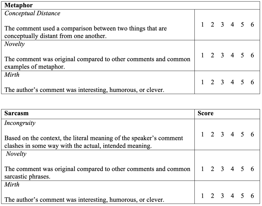
To do so, we will look at a situation where the rating data was used as an outcome variable. These data come from one of my papers arising from my PhD dissertation. Participants produced either sarcasm or metaphors in response to prompts. Two raters were trained to provide ratings for the metaphors and sarcasms using the following rubric, which was comprised of these categories. To use this rubric, each category was rated using a Likert scale with the following categories:
1 - Does not meet criterion in any way
2 - Does not meet the criterion
3 - Almost meets the criterion but not quite
4 - Meets the criterion but only just
5 - Meets the criterion
6 - Meets the criterion in every way
After I gathered the data, I found that the answers to novelty and mirth were strongly correlated, so I decided to average them together and make a single novelty/mirth score. In retrospect, I’m not sure that was the best decision. But anyhow, let’s load in the metaphor data and take a look!
You can download the data using this link, or from the Open Science Repository
## Rows: 1304 Columns: 28
## ── Column specification ───────────────────────────────────────────────────────────────
## Delimiter: ","
## chr  (6): metaphor_id, response, met_type, sex, hand, language_group
## dbl (22): subject, conceptual, nm, trial_order, met_stim, met_RT, age, colle...
##
## ℹ Use `spec()` to retrieve the full column specification for this data.
## ℹ Specify the column types or set `show_col_types = FALSE` to quiet this message.
We are interested in the columns conceptual and
nm
Look at the descriptive statistics of each column. Do you see any problems here?
##    Min. 1st Qu.  Median    Mean 3rd Qu.    Max.
## 1.000 4.500 5.000 4.563 5.000 5.000## Min. 1st Qu. Median Mean 3rd Qu. Max.
## 1.000 2.000 3.250 3.321 4.500 5.000The problem is that despite having a scale from 1-6, the raters never provided a score above 5 for either category – they did not use the entire rating scale when making their decisions! That’s not really an issue we can solve, but shows how important it is to interrogate the distribution of our data after it is collected.
Mean and SD of the rating data
Now let’s look at the mean and SD of the ratings.
Discuss - are these meaningful?
met %>% group_by(met_type) %>% summarise(mean_nm = mean(nm), sd_nm = sd(nm), mean_conceptual = mean(conceptual), sd_conceptual = sd(conceptual))## # A tibble: 2 × 5
## met_type mean_nm sd_nm mean_conceptual sd_conceptual
## <chr> <dbl> <dbl> <dbl> <dbl>
## 1 conv 3.28 1.18 4.56 0.889
## 2 novel 3.70 1.02 4.64 0.712We can also look at their distributions both with a boxplot:
met_plot <- met %>%
  pivot_longer(cols = c(nm, conceptual), names_to = 'rating', values_to = 'value')

ggplot(met_plot, aes(y = value, x = met_type, fill = rating)) +
  geom_boxplot()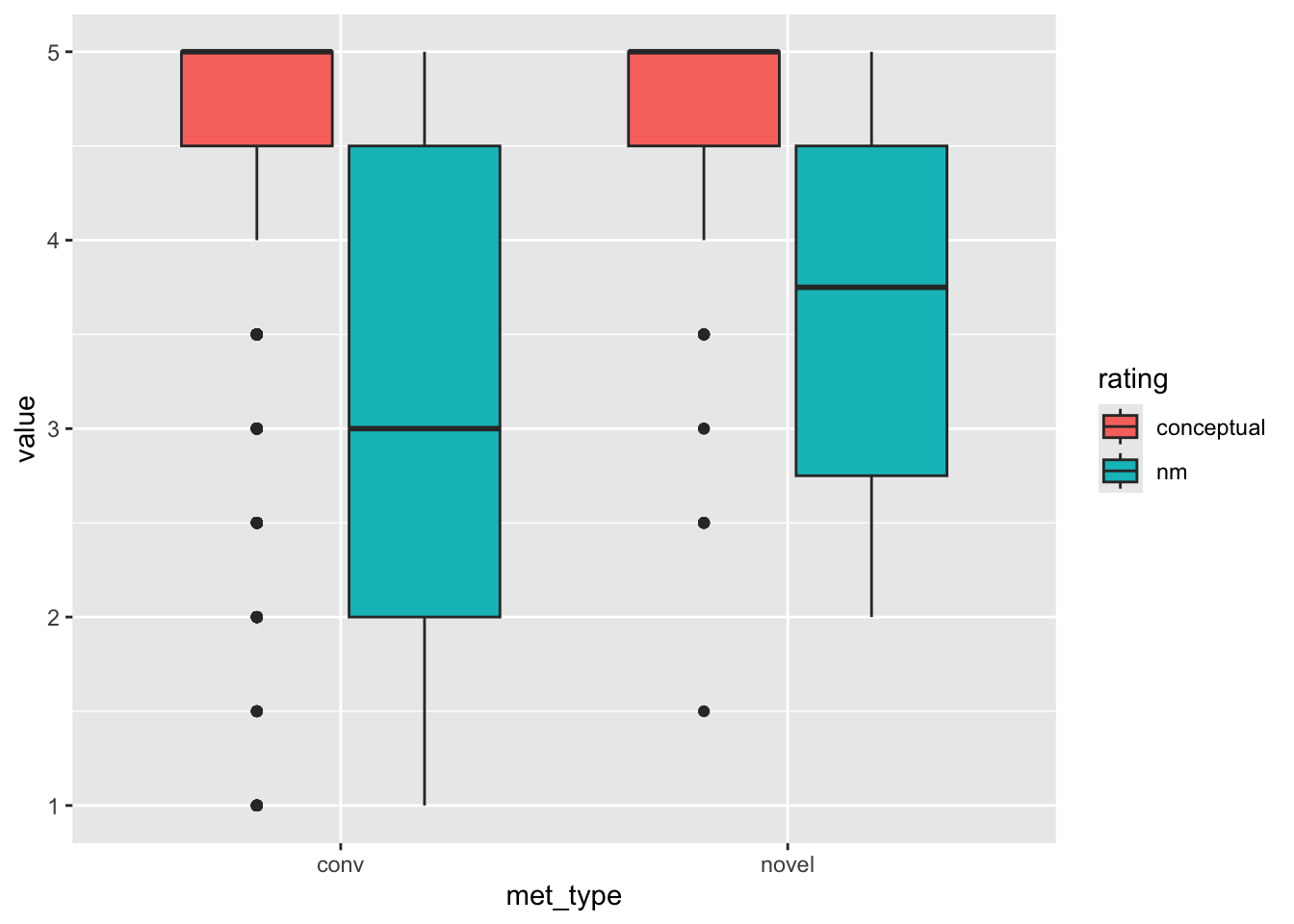
And with a violin plot:
ggplot(met_plot, aes(y = value, x = rating, fill = met_type)) +
  facet_wrap(. ~ met_type, scales = 'free') +
  geom_violin()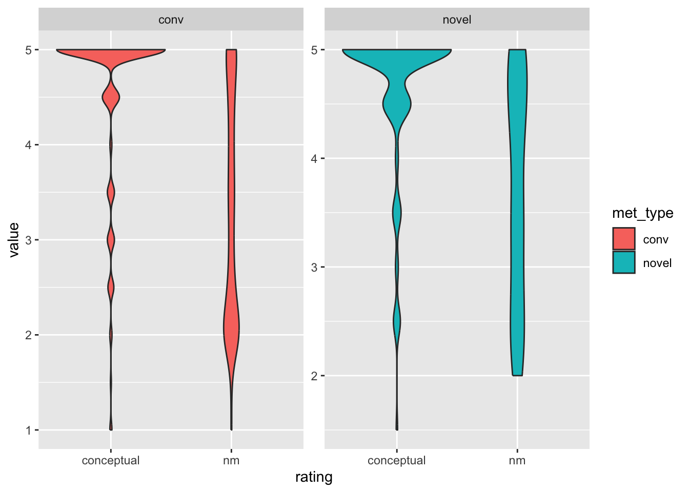
Do we see any “new” problems?
no novel metaphor has a nm rating below 2
the conceptual distance ratings include .5 midpoints
Should these be treated as numbers?
What are alternative ways to present this data? Instead of assuming a mean and standard deviation distribution (which isn’t wrong), we might find it more useful to provide frequency counts of ratings along the scale.
Let’s look at just the conventional metaphors, as they make up most of the data:
met_plot_conv <- met_plot %>%
  filter(met_type != 'novel')


ggplot(met_plot_conv, aes(x = value)) +
  facet_wrap(. ~ rating, scales = 'free_x') +
  geom_bar()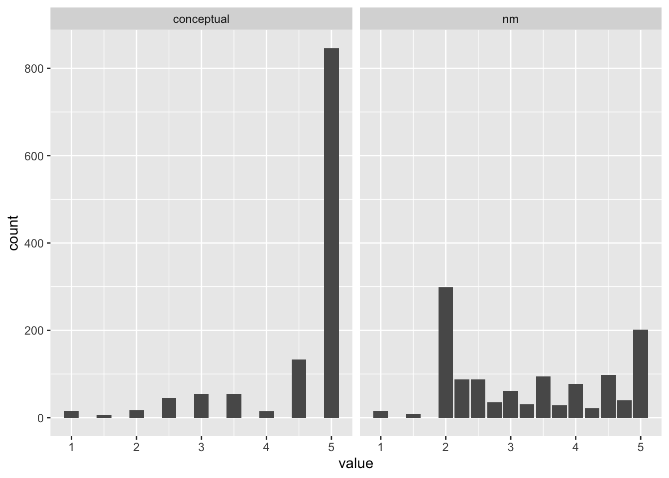
Discuss - what should we do? What can we do?