mean-as-model
2025-08-14
the normal distribution
This notebook demonstrates points made in Chapter 3 of Statistics for linguistics: An introduction using R
The goals of this notebook is to think about how to interpret the mean and standard deviation of a model, and to consider these values within the theoretical “normal distribution.”
We will use penguins rather than linguistics:
Theory versus reality
When we collect data points, we are collecting an empirical set of data, and this data will have its own distribution. This is an empirical distribution, because it represents the actuality of our data. One of the contributions of modern statistical theory and philosophy is that our empirical distributions are always approximations of some larger distributions found in the natural world. Just as we cannot gather all of the penguins in the world, we also cannot gather measures of all words, or all texts, or all learners, etc. So collecting an empirical distribution is always an approximation of some other theoretical distribution.
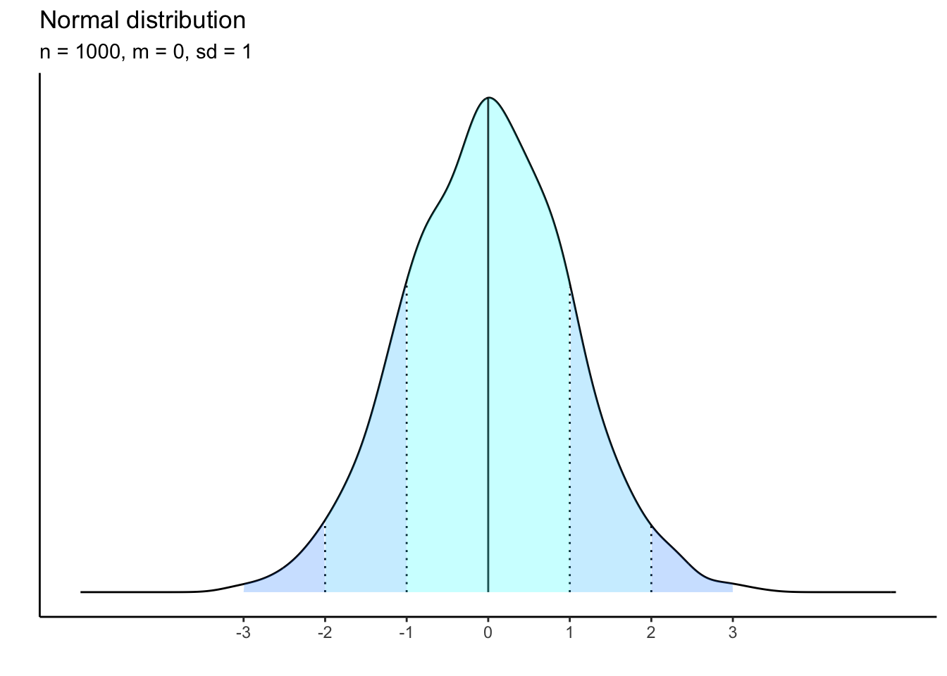
What, then, is this theoretical distribution? Perhaps the most well-known is the so-called “normal” distribution, which looks like a bell curve:
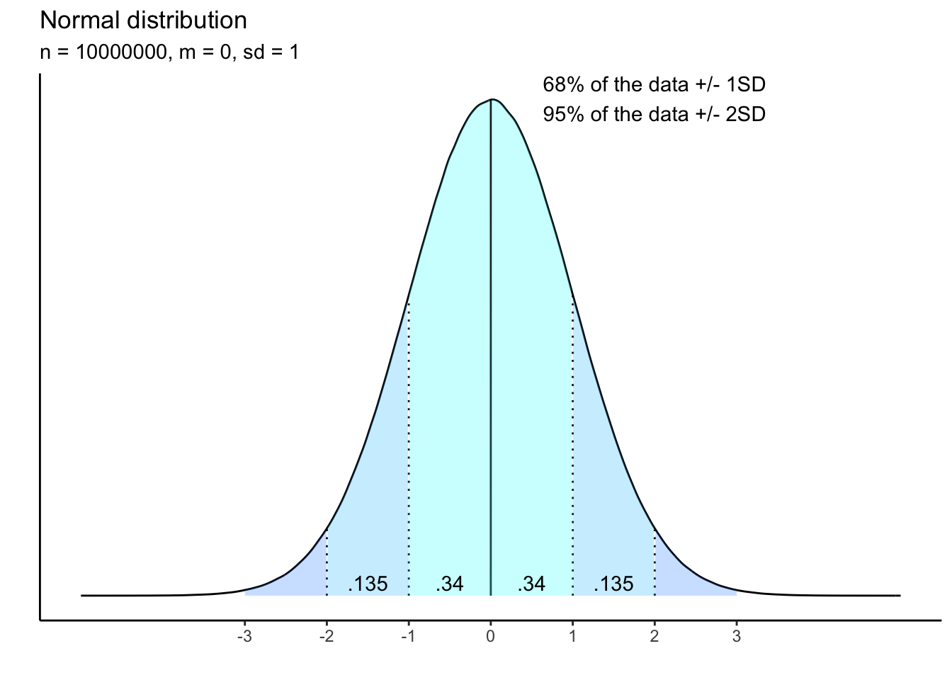
The mean is the highest point in the density curve, meaning it is the value with the highest probability. The standard deviations shows the average spread of the data from the mean. To calculate the standard deviation, you subtract the mean from each data point, square that value, sum these squares, and then divide by the total sample size minus 1.
The formula for the sample standard deviation (SD) can be written as:
\[ SD = \sqrt{\frac{\sum_{} (x_i - \bar{x})^2}{n-1}} \] Where:
\(n\) is the number of data points
\(x_i\) is each individual data point
\(\bar{x}\) is the sample mean
\(SD\) is the sample standard deviation
The standard deviation thus provides a measure of how far away from the mean the data points are, and then calculates an average of this variance.
you can do it yourself:
What is the standard deviation of these data?
c(9,18,82)## [1] 36.33333## [1] -27.33333 -18.33333 45.66667## [1] 747.1111 336.1111 2085.4444## [1] 3168.667## [1] 39.80368## [1] 39.80368How would you interpret this standard deviation? Is it very large? very small? What would happen to it if we replaced 82 with a smaller number?
mean and sd are parameters
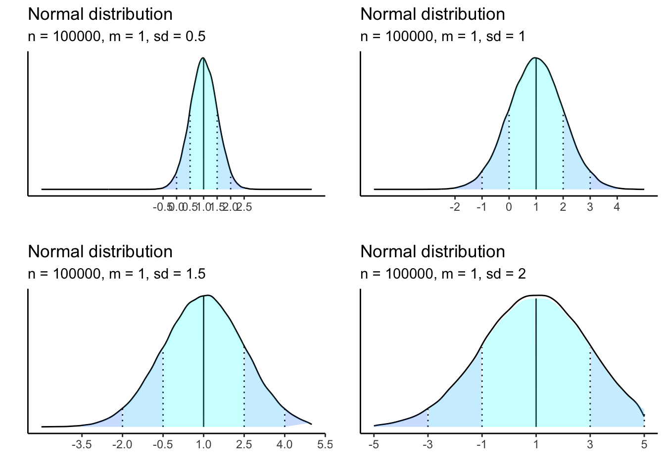
A normal distribution can have any mean or SD, and the resulting density curve will change visually, but still carry the same properties of the normal distribution.
sample size matters
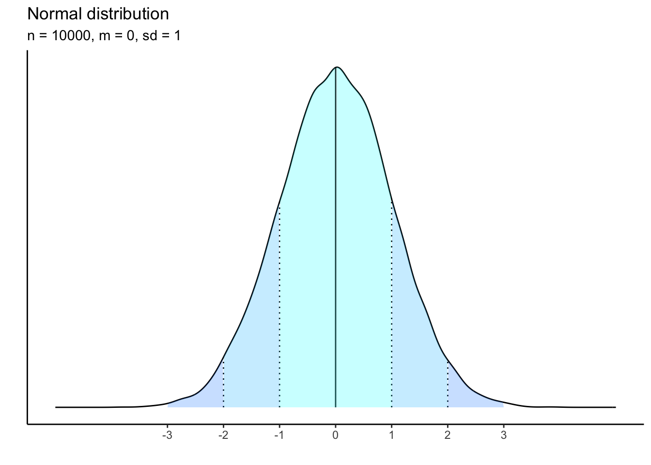
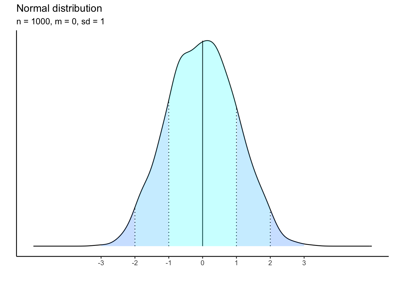
The logic of this distribution is that it approximates that with enough data gathered, empirical distributions will eventually take on the properties of a normal distribution. But we do not normally have 1 million observations. Consider what happens when the sample sizes drop.
This plot has 10000 observations:
1000 observations:
100 observations:
10 observations:
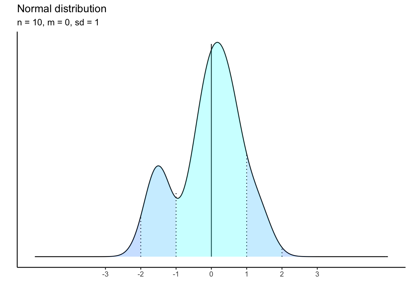
What is happening to the shape of the distribution as our sample size shrinks? it becomes less and less bell-curved showing that there is a threshold of empirical data that must be gathered in order to approximate the theoretical distribution.
But statistical models will assume a normal distribution, which means it assumes that your empirical data sample will follow the normal distribution in the end, and thus make assumptions about the shape of the data and the overall probability of sampling a value relative to the mean versus the standard deviation.
how normal are our penguins?
How can we “assess” normality in our sample? Plotting is a good way to get an idea of the underlying shape of the data. But as you just saw, lower sample sizes mean that the plot will look less and less like a perfect bell curve. But we can start with plotting. To look at distributions, we might want to use histograms or what I’ve been using here, density curves.
Let’s explore whether the body mass of our penguins demonstrates properties of the normal distribution.
histograms plots
Firstly, let’s plot a histogram of body mass. You can do this with
ggplot and the geom_histogram() geom.
The geom_histogram() is going to use an underlying
counting statistic, so it needs to have a free axis to plot that count
on. Therefore the only information you need to provide to the geom is
either the x or the y axis and the variable you want to plot.
Look at the histogram - how would you describe this distribution?
## `stat_bin()` using `bins = 30`. Pick better value with `binwidth`.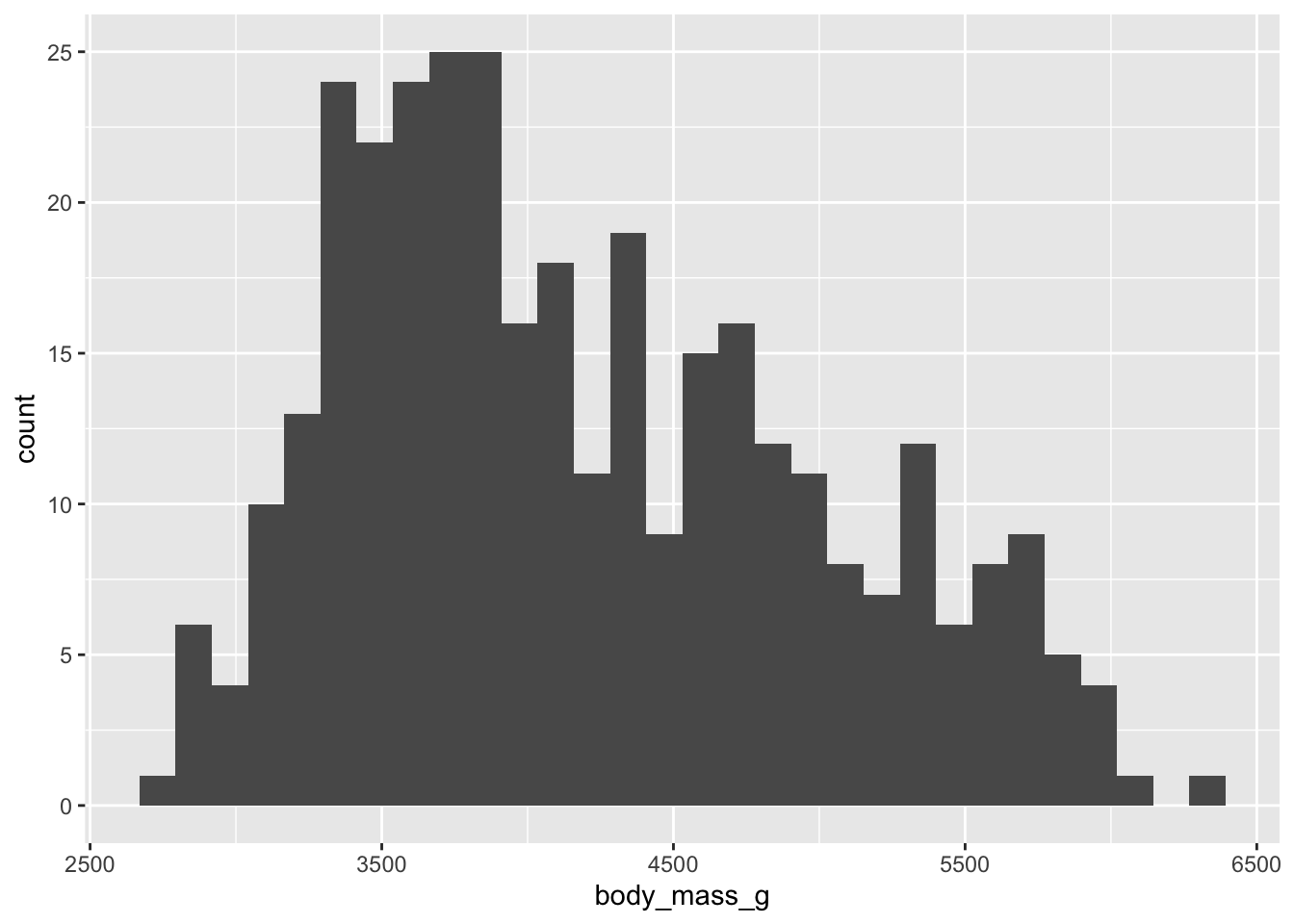
Much like other geoms, we can use fill to add grouping information to
our plot. Try using 'species' as the value for
fill. What can we say about these distribution? How much
overlap do you see? how much difference do you see?
## `stat_bin()` using `bins = 30`. Pick better value with `binwidth`.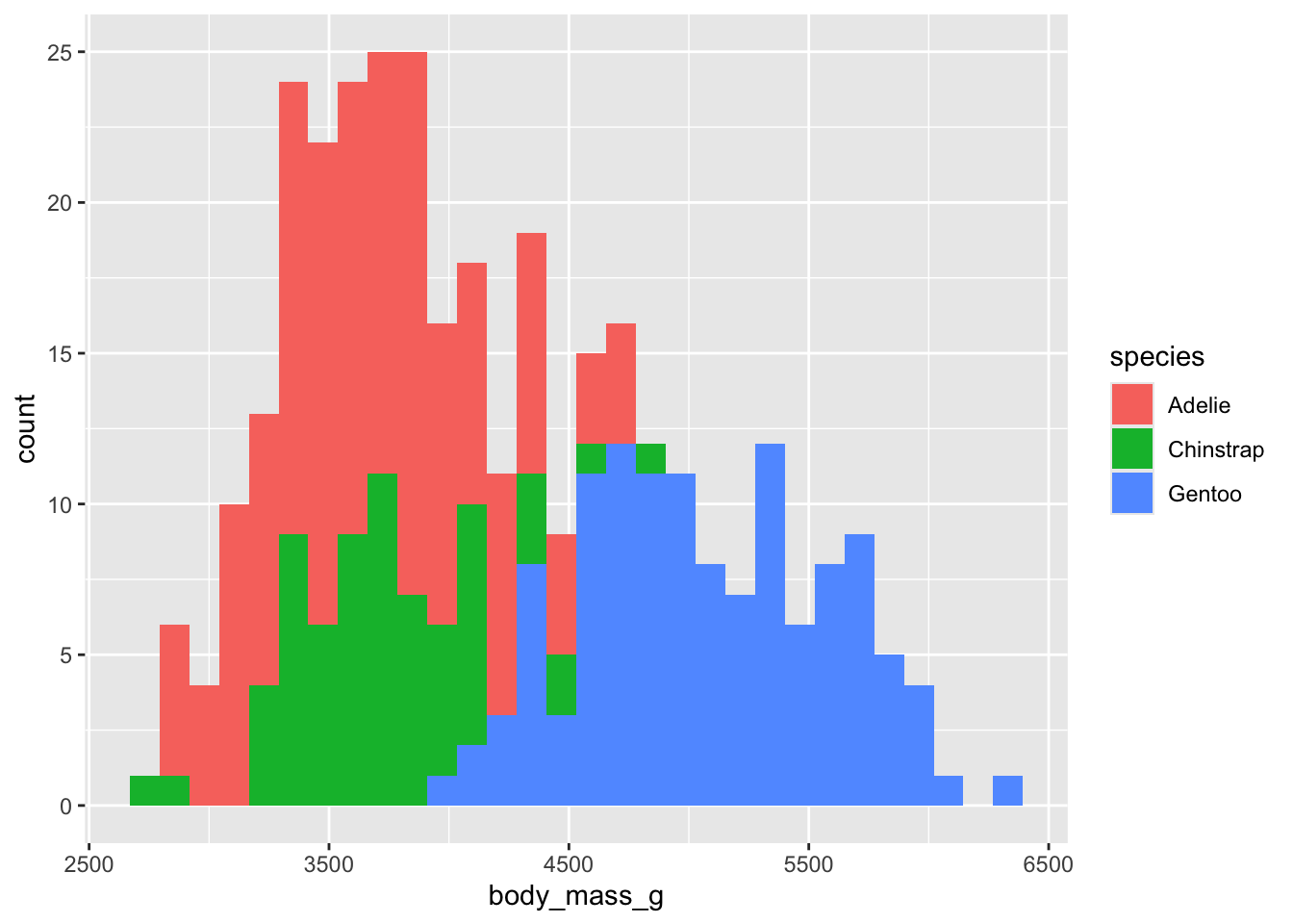
While histograms are good, it might be easier to start comparison distributions with a different geom - the density curve.
density plot
Use the geom_density() to plot a density curve, which is
what I used to create all of the earlier plots. Fit a density curve of
the entire population of penguins and their body mass.
You interpret a density curve as a total distribution of probability of data. The higher the curve, the higher the probability for that point on the x-axis.
How would you interpret this density plot? Around what value is the most likely body mass? The least likely?
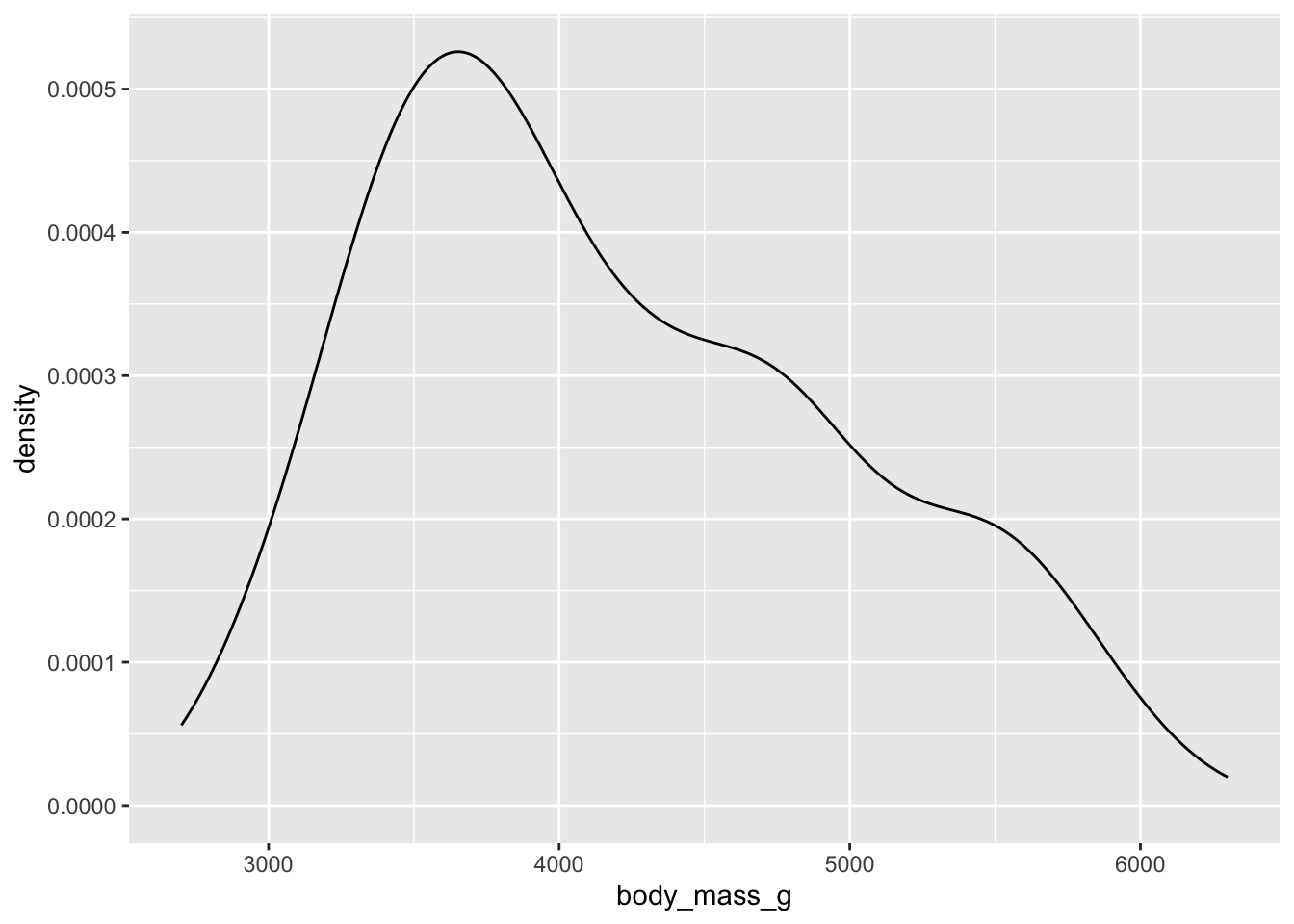
You should notice that the overall shape is similar to the histogram. The difference is that instead of counting the number of penguins within bins or ranges of body weight (histogram), the density curve is “smoother” and modelling the probability of each individual point (i.e., not grouping the data into buckets).
annotating the plot with text information
It would be ideal to include information about the distribution onto the density curve. Let’s refresh ourselves on what the mean and SD of the penguin body mass. I’ll save them to variables so it is easier to work with them later.
body_mass_mean <- mean(penguins$body_mass_g, na.rm = T)
body_mass_sd <- sd(penguins$body_mass_g, na.rm = T)
body_mass_mean## [1] 4201.754## [1] 801.9545We can add this information to out plots using the
annotate() feature in ggplot. The annotate()
function will add one single layer to the plot. It requires knowing
which geom you want to use, which include segments (lines), shapes, or
text.
Let’s add a text label for the mean.
To do so, we need to tell annotate() which geom we want
to use, In this case it will be 'text'. The
geom_text() requires knowing where on the plot the text
should go (using x,y coordinates), as well as the value of
label (i.e., the actual text).
# add the mean to the plot
ggplot(penguins, aes(x = body_mass_g))+
geom_density() +
annotate('text', x = body_mass_mean, label = round(body_mass_mean,0), y = 0, color = 'red')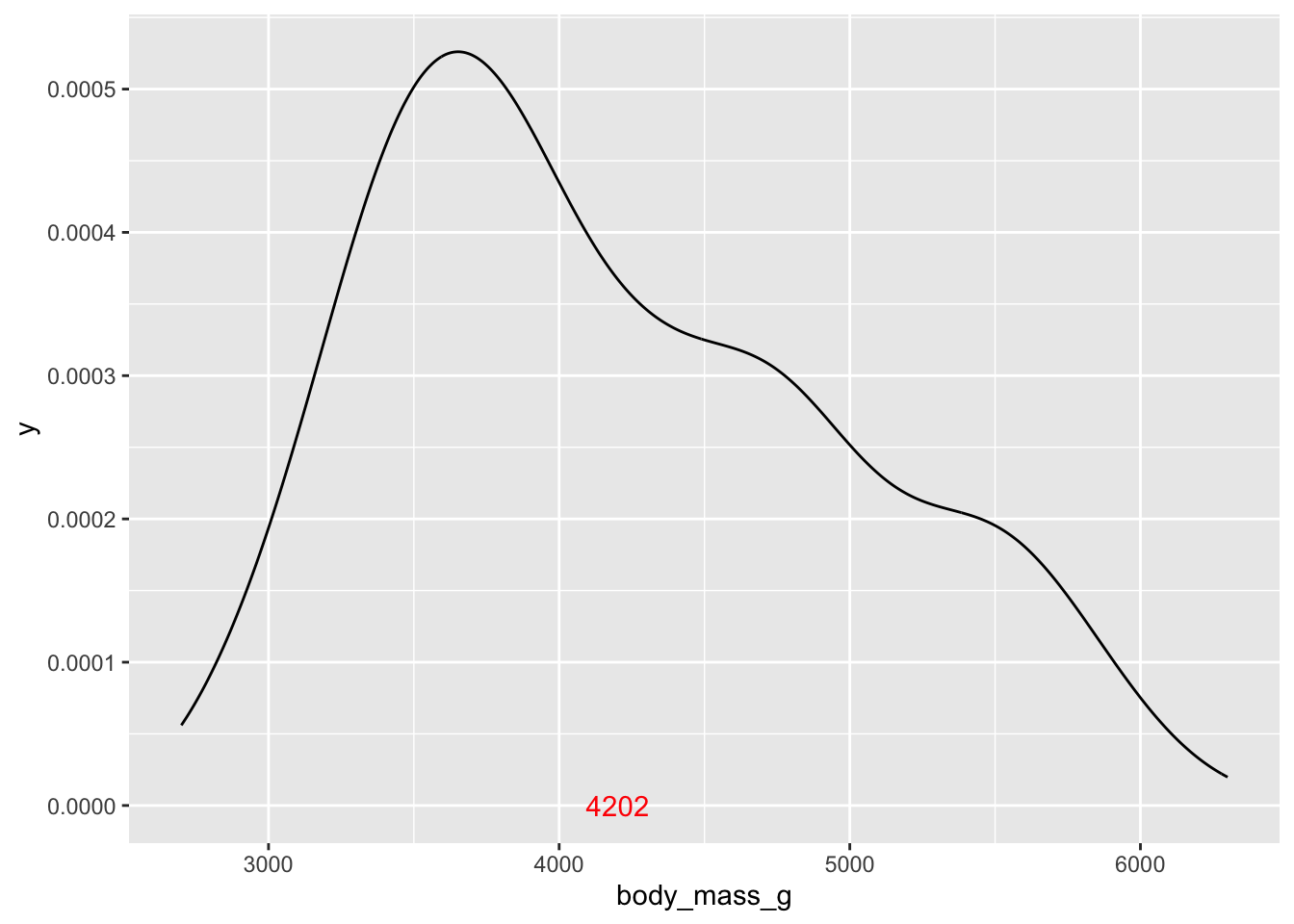
We can repeat this and add the markers for +/-1 standard deviation to the plot. To calculate these, we need to subtract or add the standard deviation from the mean
# add +/- 1 standard deviation to the plot
ggplot(penguins, aes(x = body_mass_g))+
  geom_density() +
  annotate('text', x = body_mass_mean, label = round(body_mass_mean,0), y = 0, color = 'red') +
  annotate('text', x = body_mass_mean + body_mass_sd,
           label = round(body_mass_mean,0) + round(body_mass_sd,0), y = 0, color = 'blue') +
  annotate('text', x = body_mass_mean - body_mass_sd,
           label = round(body_mass_mean,0) - round(body_mass_sd,0), y = 0, color = 'blue')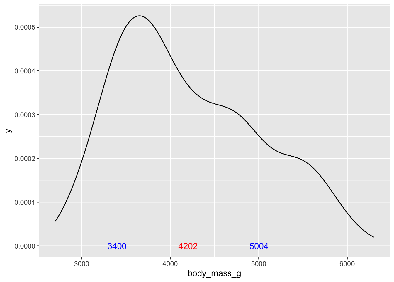
We could continue and add additional standard deviations:
# add +/- 2 standard deviations to the plot
ggplot(penguins, aes(x = body_mass_g))+
  geom_density() +
  annotate('text', x = body_mass_mean, label = round(body_mass_mean,0), y = 0, color = 'red') +
  annotate('text', x = body_mass_mean + body_mass_sd,
           label = round(body_mass_mean,0) + round(body_mass_sd,0), y = 0, color = 'blue') +
  annotate('text', x = body_mass_mean - body_mass_sd,
           label = round(body_mass_mean,0) - round(body_mass_sd,0), y = 0, color = 'blue') +
  # simple double the sd to move out 2 standard deviations:
  annotate('text', x = body_mass_mean + (body_mass_sd*2),
           label = round(body_mass_mean,0) + (round(body_mass_sd,0)*2), y = 0, color = 'magenta') +
  annotate('text', x = body_mass_mean - (body_mass_sd*2),
           label = round(body_mass_mean,0) - (round(body_mass_sd,0)*2), y = 0, color = 'magenta')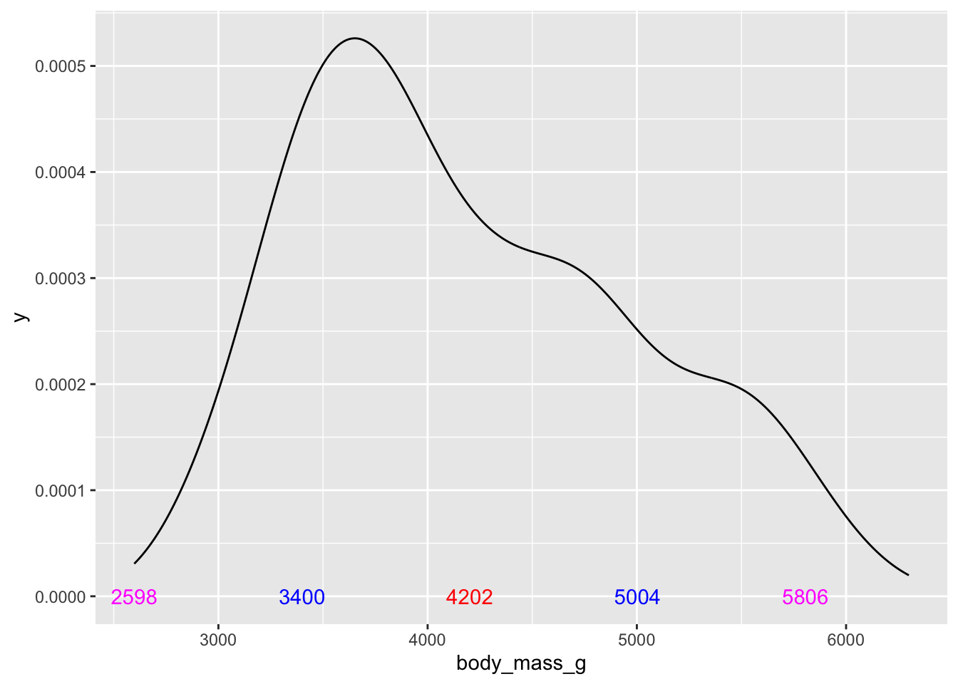
testing normality?
What do you think - does that distribution of the entire population of penguins have properties of a normal distribution? Well, we know that following a normal distribution, 68% of the data should be +/- 1 standard deviation of the mean, and 95% should be within +/- 2 standard deviations. We can calculate this quite easily.
Remember that nrow() gives us the size of the data
frame. So we can use filter() commands to find the total
number of rows in the data that meet specific criteria:
# all the penguins within one standard deviation of the mean
nrow(filter(drop_na(penguins), body_mass_g <= 5004 & body_mass_g >= 3400)) /
  # total size of penguins
  nrow(drop_na(penguins)) * 100
## [1] 67.26727What about the 95% threshold? We would need to ask for everything within +/- 2 standard deviations on either side of the mean.
# all the penguins within two standard deviations of the mean
nrow(filter(drop_na(penguins), body_mass_g <= 5004+body_mass_sd & body_mass_g >= 3400-body_mass_sd)) /
  # total size of the penguins
  nrow(drop_na(penguins)) * 100
## [1] 97.2973What do you think?
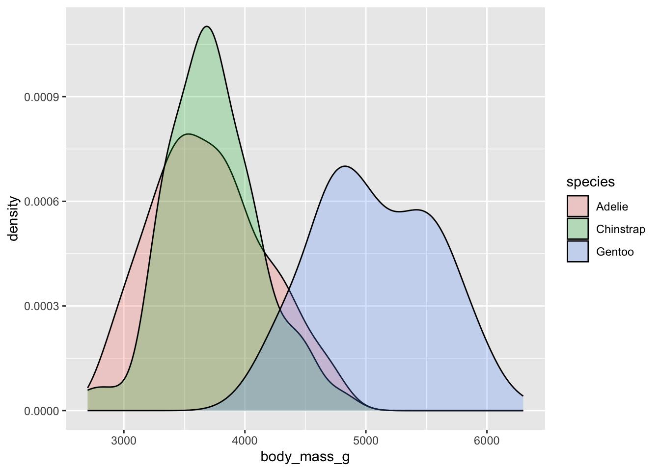
comparing group distributions
Just like histogram, we can use the fill aesthetic to separate our groups in the plot. If we reduce the alpha, we can now get a very good idea of how our distributions overlap. We can look at this plot and see precise similarities and differences in the distributions. This is at the heart of statistical comparisons - when we fit a statistical model, we are asking about the degree to which these distributions differ.
Do you think these separate groups also demonstrate properties of the normal distribution?
the mean is a model
All of this is to say, what is the mean of a sample really telling us? It is a bit more than a simple descriptive or number we add to a table in order to write a paper. The mean is actually a model - a prediction based on the data and an assumed underlying distribution. If we have a mean value of an empirical sample, that is our best guess of what an unseen value would look like.
If you were to collect a new Gentoo penguin, your best guess is that it weight about 5092 grams.
## # A tibble: 3 × 2
##   species    m_bw
##   <fct>     <dbl>
## 1 Adelie    3706.
## 2 Chinstrap 3733.
## 3 Gentoo    5092.
You would also have some confidence that 68% of the time, the actual body mass of a new Gentoo penguin would be somewhere between the mean and +/- one standard deviation. In this case, ~68% of the Gentoo penguins would weight between ~4600 and ~5600 grams. You can apply the same logic to the other penguins.
# penguin standard deviations
drop_na(penguins) %>%
  group_by(species) %>%
  summarise(sd_bw = sd(body_mass_g))
## # A tibble: 3 × 2
## species sd_bw
## <fct> <dbl>
## 1 Adelie 459.
## 2 Chinstrap 384.
## 3 Gentoo 501.assuming normality
So perhaps you’ll have a somewhat better idea now about what someone means when they say “assuming normality” as it pertains to statistics. This is an assumption about the properties of the distribution that the empirical sample was drawn from. There are many other distributions that data can take, and understanding the underlying distribution helps you to choose the right statistical model for your data.